
Team: John Kowalski & Aaron Mohr
The Problem
With the increasing amount of new venues around the city, it can be difficult for people to keep track of all of them and figure out which places are worth checking out. Current applications provide crowd-sourced location reviews (i.e. Yelp) that rely on the opinion of strangers. This method can be inaccurate for certain users because each person is unique and has different likes/dislikes. How would someone know which ‘good’ reviews to trust and which ‘bad’ reviews not to trust?
The Solution
Portr is an app that allows users to send and receive recommended locations from their friends and family. This will help the user build a more personalized directory that they can trust. It will provide people with intimate and insightful recommendations from their closest social network rather then having to relying on the ratings of strangers.
The Research
During the initial phase of Portr, each one of us conducted an in-person interview using the questionnaire we created. We also wanted a broader range of data, so we used Google Form as a way to survey more people. From there, we created our PACT analysis and a systems requirements chart.
TARGET AUDIENCE
Portr is designed to accommodate a wide range of users who like to explore new venues.
People
Adventurers and travellers who like to discover new places (i.e. restaurants, bars, landmarks, etc) around the city
Activities
The app could be used at the user’s leisure, usually during the day or throughout the week.
Context
Users could use the app during their down time, at home or on the go.
Technologies
It will require touch screen and geospatial technology.
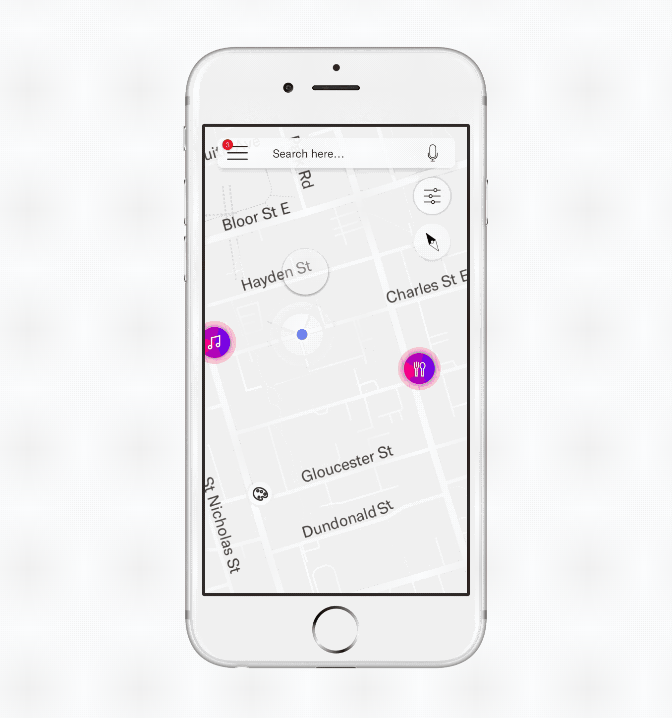
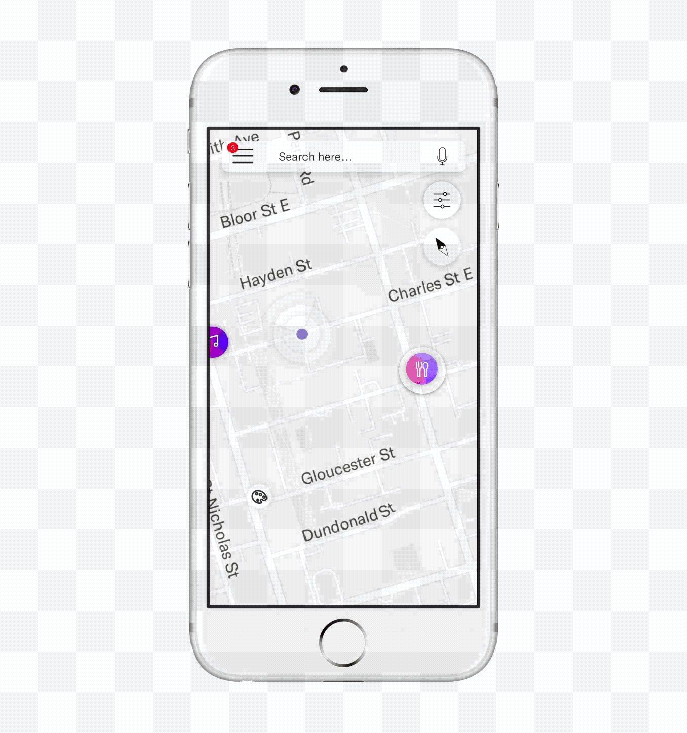
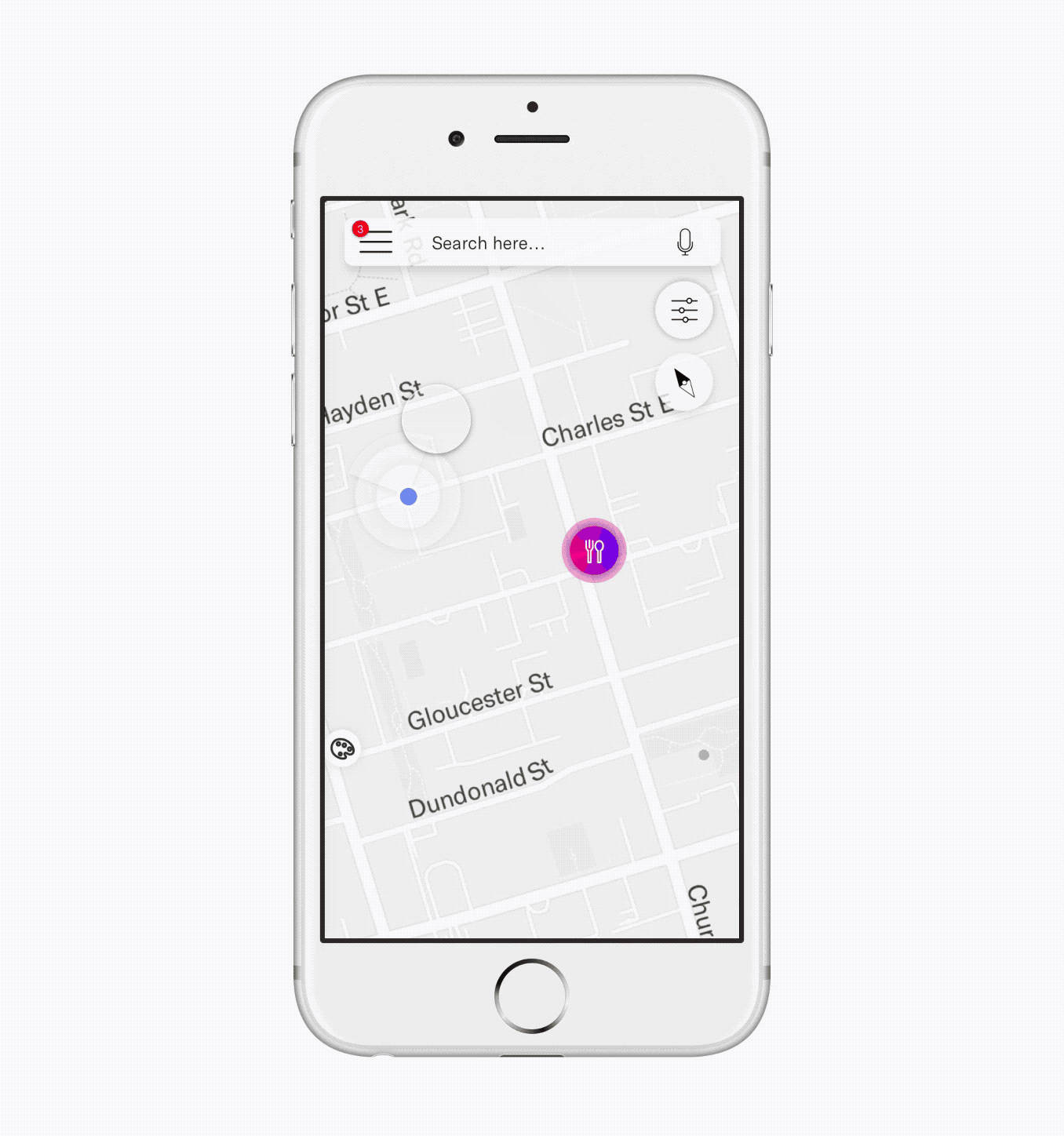
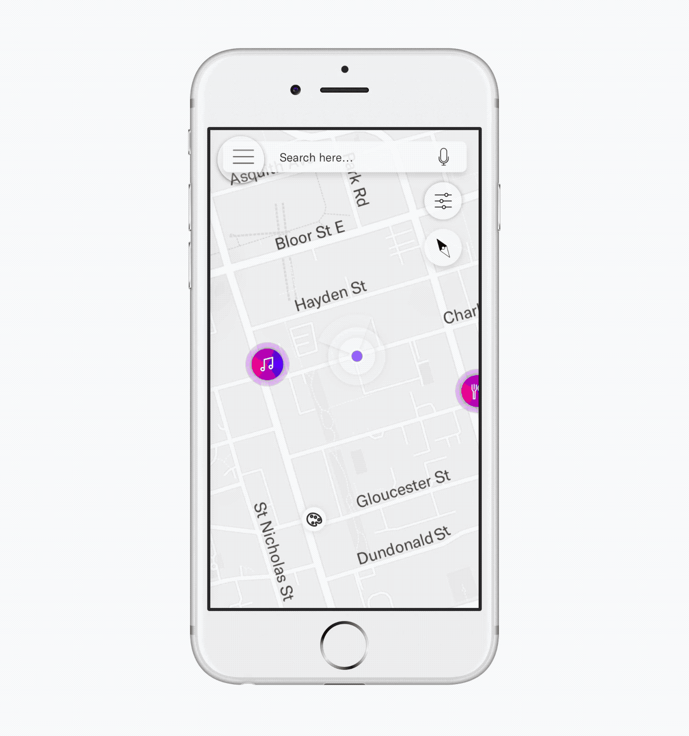
KEY FEATURES
PROCESS
My group and I came up with a few rough iterations of the key features we wanted for Portr. From some of the rough sketches, we translated it onto the low-fidelity wireframes and constantly refined it.
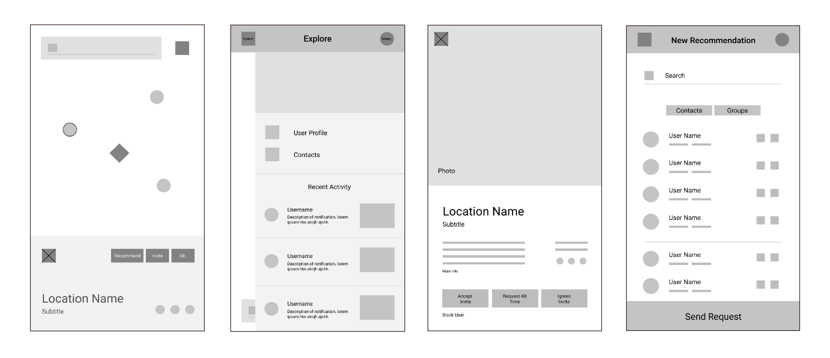
USER TESTING
We used Quant-UX to test our prototype with three different participants. During our user testing sessions, we discovered a few flaws in the first version of our prototype. A major issue we came across was the lack space the map had after the user tapped on the location icon. Furthermore, there were no street names on the map, which can be confusing. The open and closed icons for street location was also not clear enough for the participants to understand.
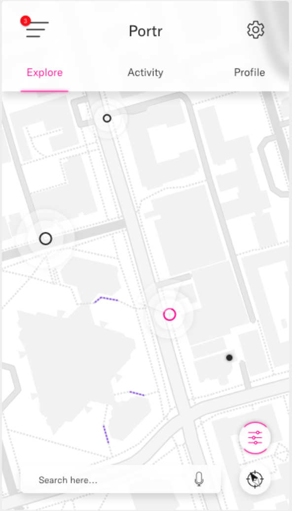
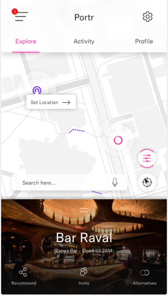
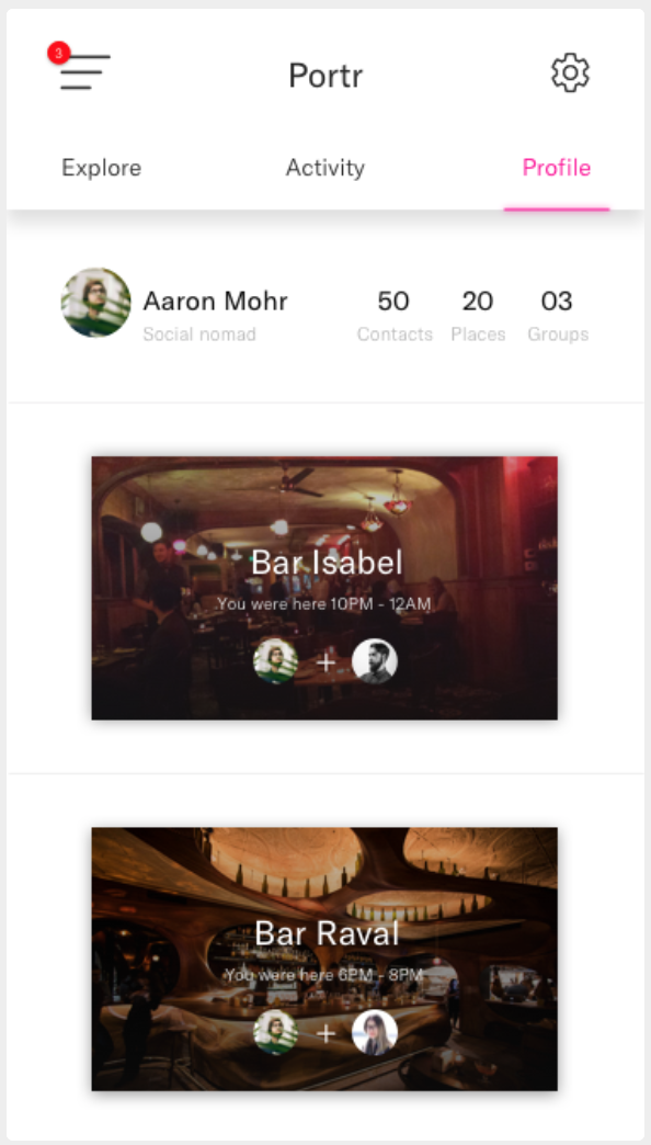
High Fidelity
WALK THROUGH
When the user taps on a location icon they, an overview of the place pops up. The user can swipe upwards to view the location details. They can also choose to add the place to their wishlist.
SEND AN INVITE
Users can arrange a time and send an invite to all their friends.
SEND A RECOMMENDATION
Users can quickly send a location recommendation.
ALTERNATIVE TIME
Users can arrange an alternative time if the one they recieved does not work for them
Outcome Reflection
In total, our group put in more than 190 hours into the planning, designing, testing and refinement of Portr. Throughout this project, I learned the importance of teamwork and how to challenge ideas that were not working. I discovered how crucial user testing was when it came to refining and improving the experience of our final product. Moreover, I gained a lot of knowledge using new platforms such as Figma and Quant-UX. To further improve upon our app, I would like to have tested it on a wider range of user groups in order to get a better understanding of user needs.
HELLO THERE!
My name is Gillian Wu and I am currently in my third year studying at the York Sheridan Design program. I believe design and aesthetics are only powerful when they communicate a substance in an effective way. Good design looks visually pleasing, but great design comes from the result of critical thinking and lots of failed attempts.
EXPERIENCE
- Social Markt - 2016
- The Real Estate Office - 2016
EXTRACURRICULARS
- RU Hacks - 2017
- Design Jam - 2016
- YSDN: The Intermission - 2016
I am currently looking for internship opportunities to expand my skills as an emerging designer. Feel free to send me a message!