
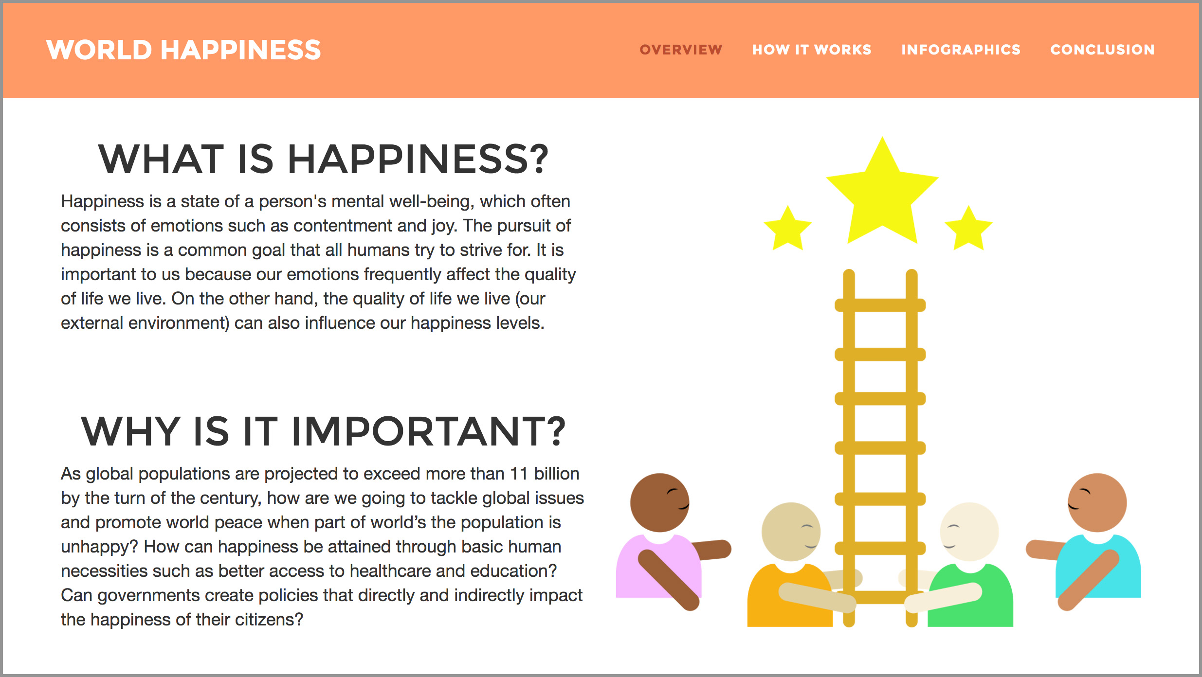
The Problem
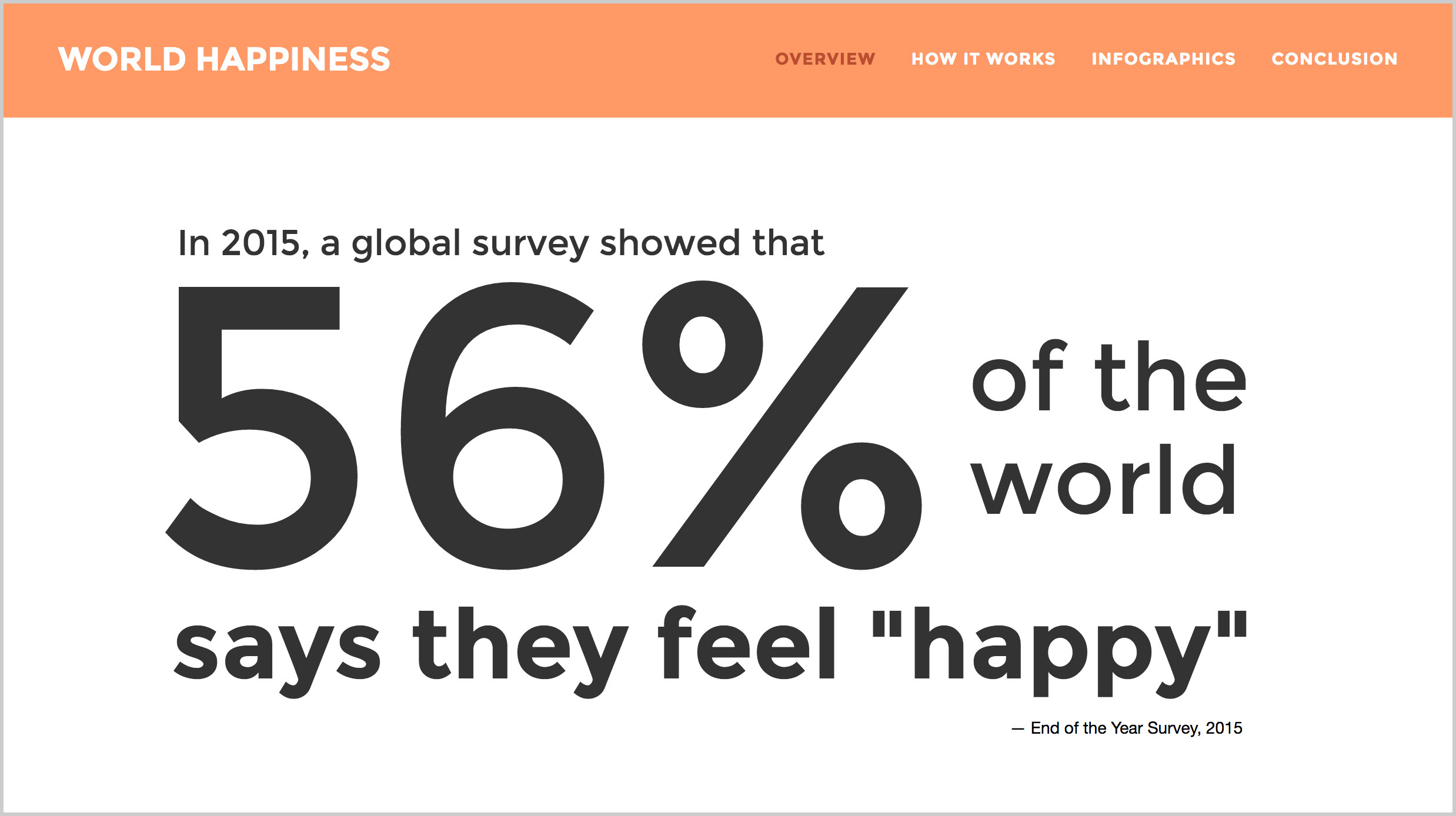
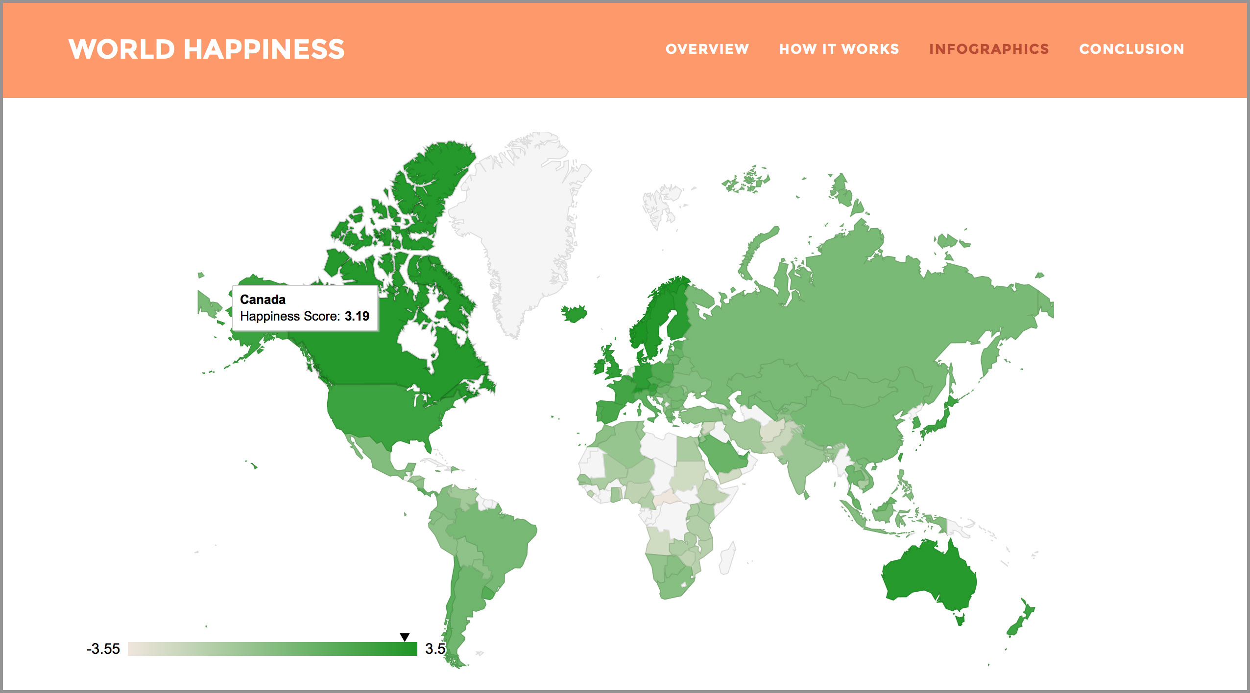
A studied conducted in 2015 showed that only 56% of the world’s population says they feel happy. Happiness is often a common human goal, but if only part of the world is happy, how can we begin to address critical global issues? How can governments improve the happiness of their citizens through policies and infrastructure investment? What are the key factors
The Solution
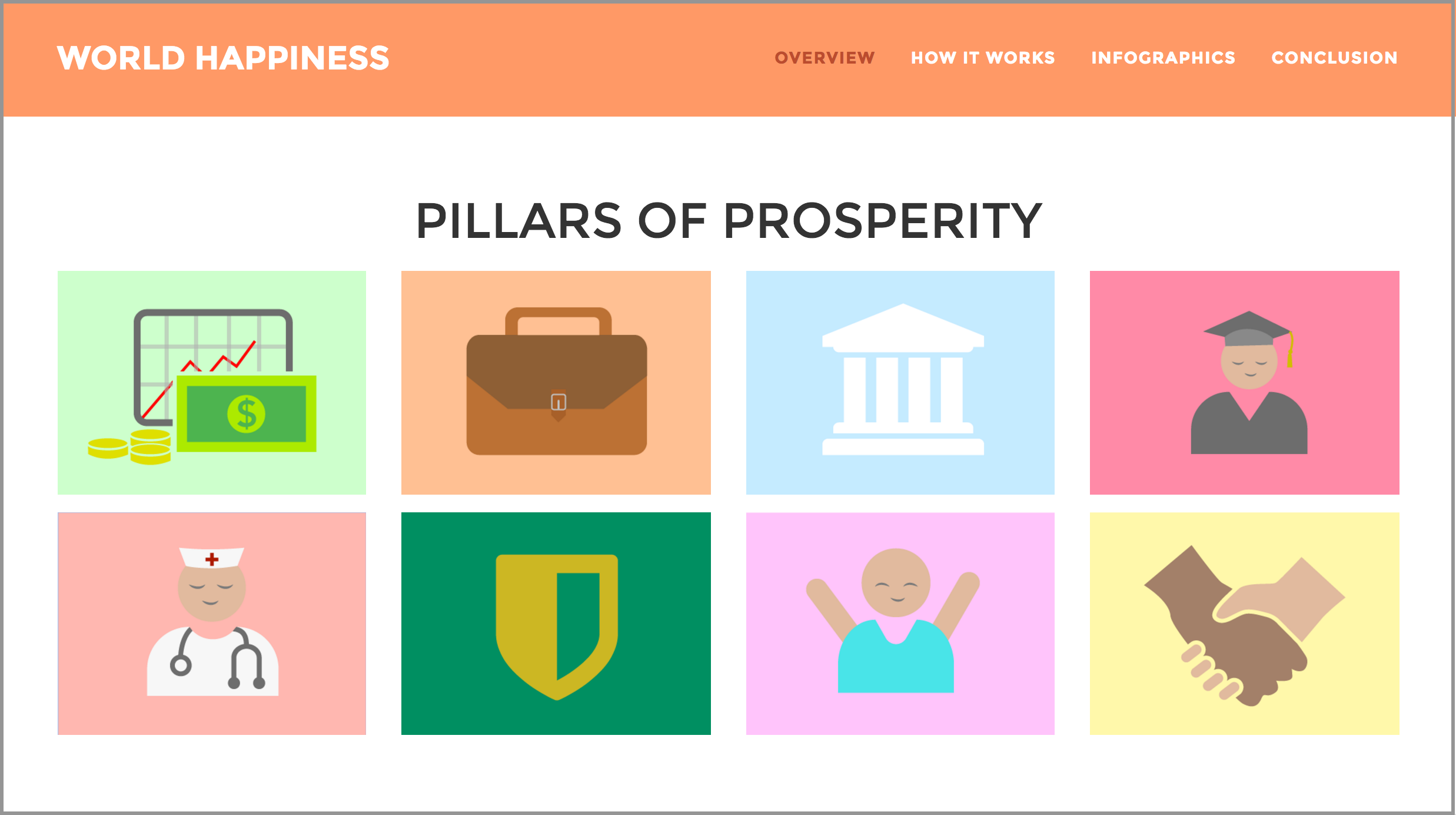
In this project, I want to take a look at the happiness of each country based on the eight pillars of prosperity. By comparing and contrasting the quality of infrastructure in each country, it will help illustrate the kinds of policies that are needed for citizens to flourish. Through storytelling, I want to communicate the growing inequalities seen around the world by encouraging the audience to explore the links between each variable and the impact of the overall prosperity score.
The Research
DATA
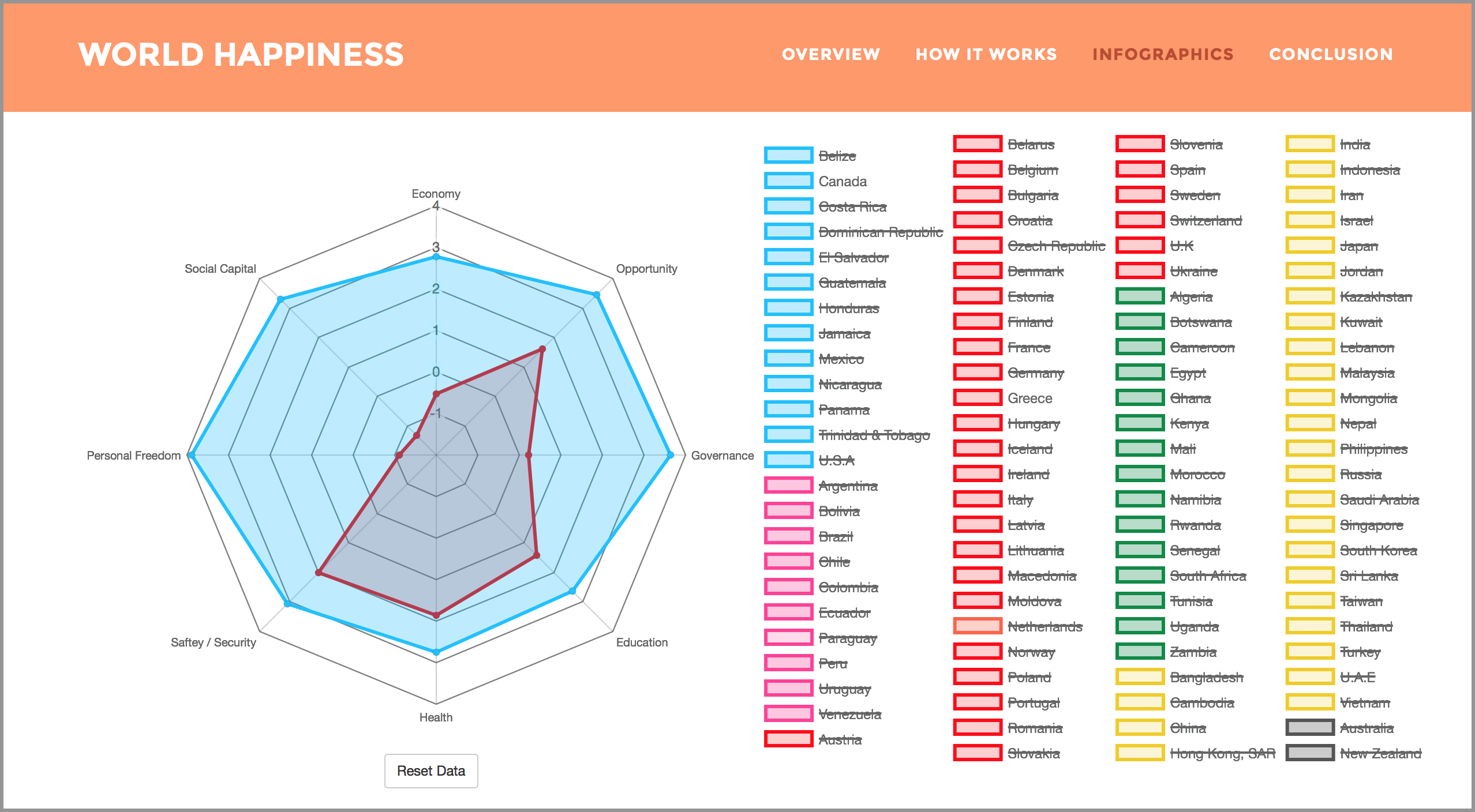
The dataset I used was for this project was the Legatum Prosperity Index. They had eight different variables, which included economy, opportunity, governance, education, health, safety/security, personal freedom and social capital. From there, I narrowed it down to the top 100 countries on the dataset to hone in on the information I chose to visualize.
PROCESS
I used charts.js and Google charts as a method of visualizing the data. The best method to illustrate the eight pillars of each country was to use a radar chart. At first, I had difficulties figuring out how I could layout different colours for 100 countries. After some trial and error, I decided that the best way to go about it was to categorize the countries into continents and choose a colour for each continent.
Outcome Reflection
It was challenging to use type as image on the printed poster because the numbers can be overwhelming and overpower the overall message. I solved that by trying to add more visuals with the numbers and breaking it up on certain sections. Moreover, I also learned that transitioning from print to an interactive device is trickier then it seems and that some of the designs needs to be redone for that tablet version.
HELLO THERE!
My name is Gillian Wu and I am currently in my third year studying at the York Sheridan Design program. I believe design and aesthetics are only powerful when they communicate a substance in an effective way. Good design looks visually pleasing, but great design comes from the result of critical thinking and lots of failed attempts.
EXPERIENCE
- Social Markt - 2016
- The Real Estate Office - 2016
EXTRACURRICULARS
- RU Hacks - 2017
- Design Jam - 2016
- YSDN: The Intermission - 2016
I am currently looking for internship opportunities to expand my skills as an emerging designer. Feel free to send me a message!