The Problem
Current food nutrition labels are difficult for users to understand. In fact, approximately 59% of consumers have issues comprehending the information presented on food packages. The nutritional labels often cause bewilderment due to the lack of visual hierarchy. Users are more likely to read the information on the top panel and skip over crucial nutritional data on the bottom. With obesity on the rise, understanding the nutritional contents in one’s food is an important step in maintaining a healthy lifestyle. Many people want to make healthier choices in their diet, but do not know where to start. Food labels should make it easier for consumers to make informed decisions when buying food, not harder.
The Solution
Create a smart label and a companion app that allows users to scan or tap a food product to get its nutritional data. In the app, users will be able to get an in-depth visualization and information pertaining to the product’s dietary contents. Furthermore, users can look at type of food choices they made throughout the day, week and month. This will help them make critical decisions when grocery shopping or at a restaurant.
The Research
TARGET AUDIENCE
This product is aimed for people who are conscious of the nutrition they consume and want to watch their dietary intake for certain foods. It is also designed for users who do not have much knowledge on the kinds of nutrients they should take more of and the ones they should limit.
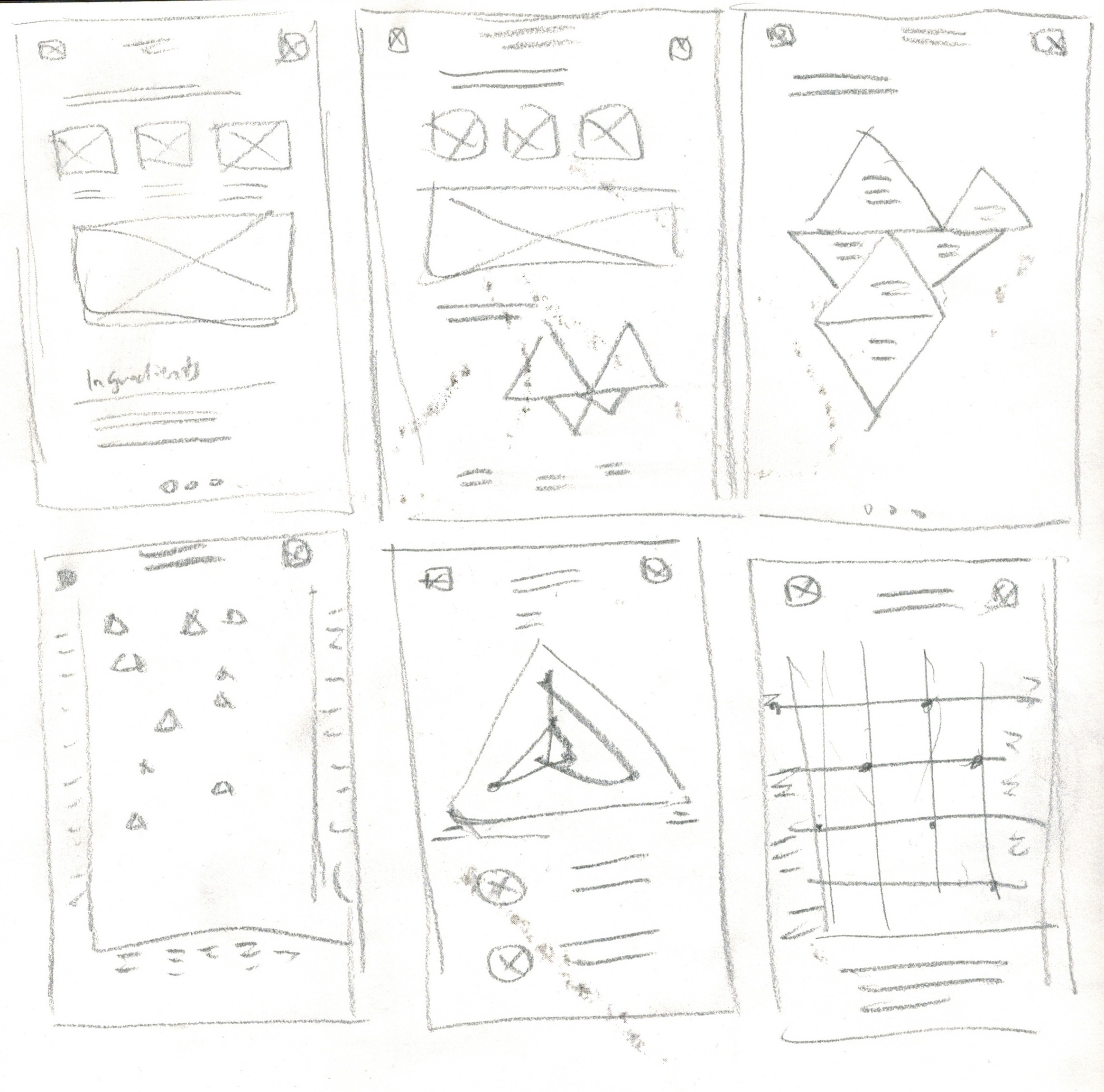
PROCESS
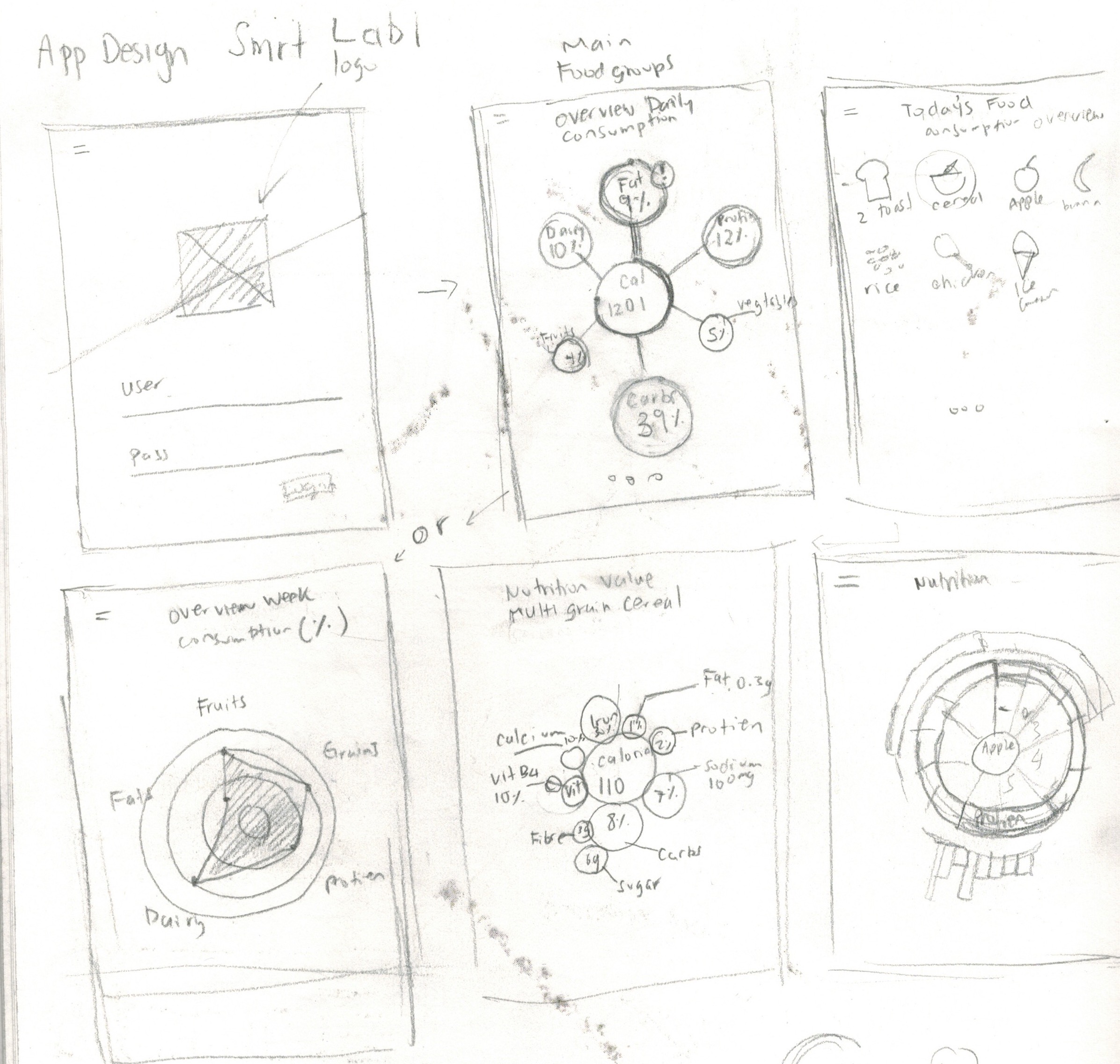
I started sketching rough outlines of different data visualization methods. My goal was to try to explore unique and creative styles of information design that are not normally seen.
High Fidelity
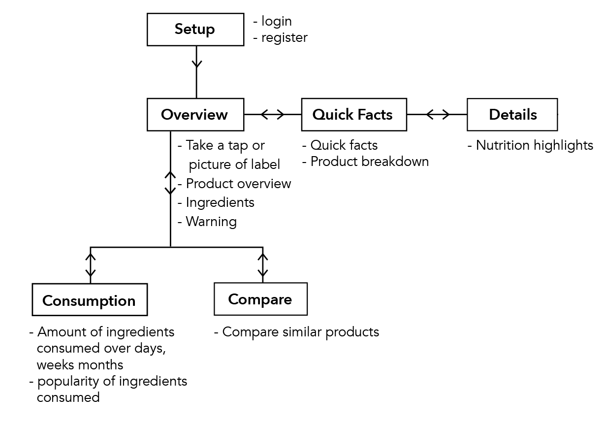
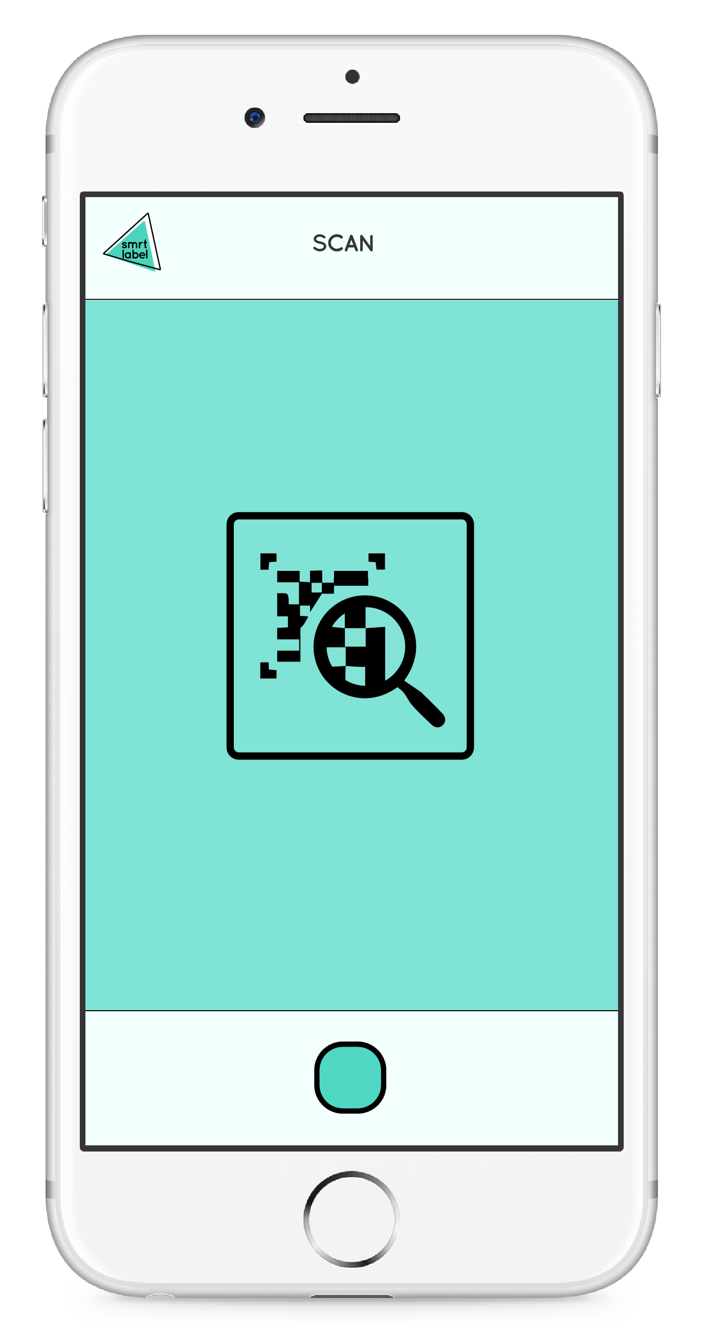
WALK THROUGH
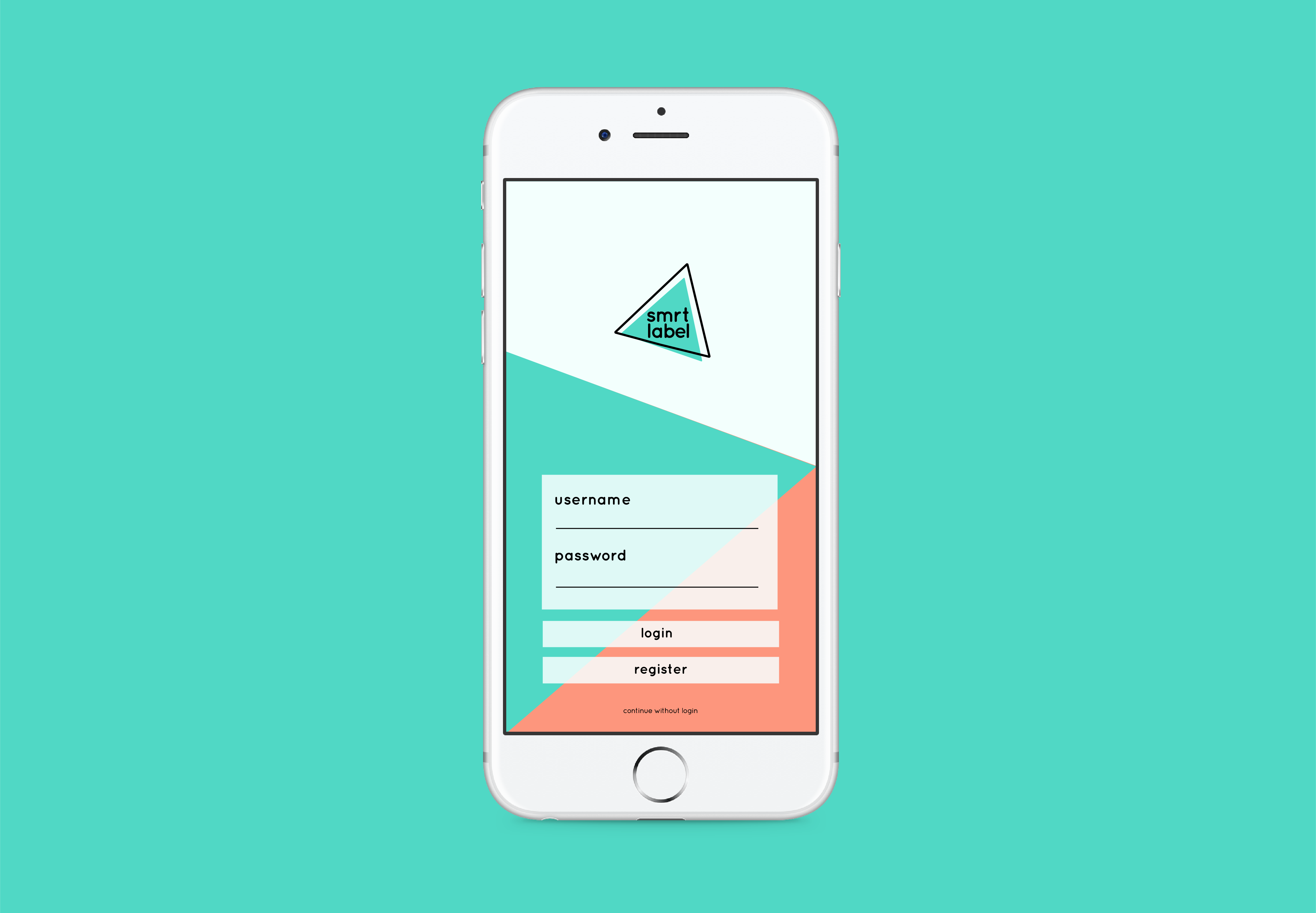
When the user first logs into the app, they have the option to capture a photo of the Smrt Label that is on the food package or search through the navigation.
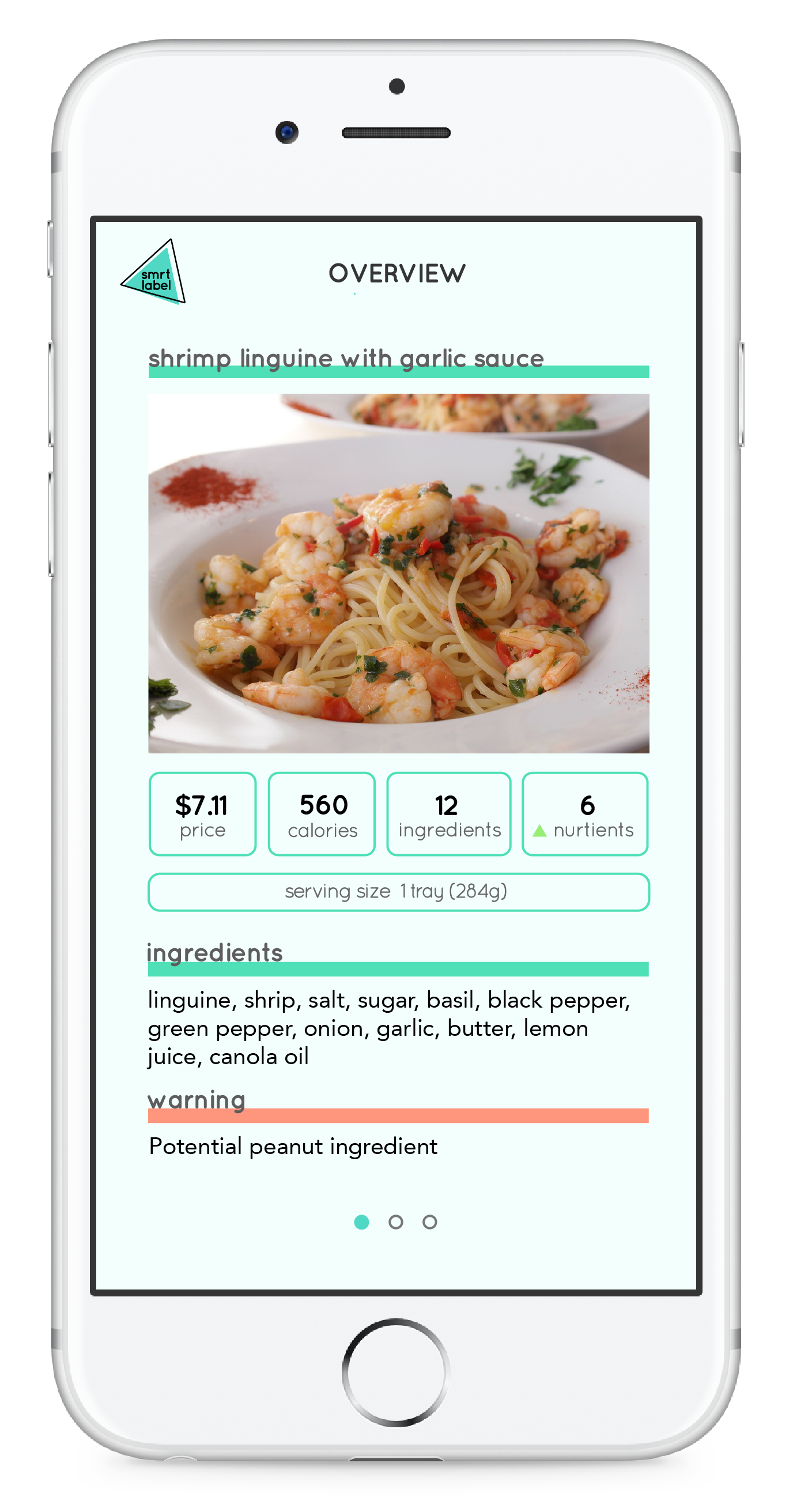
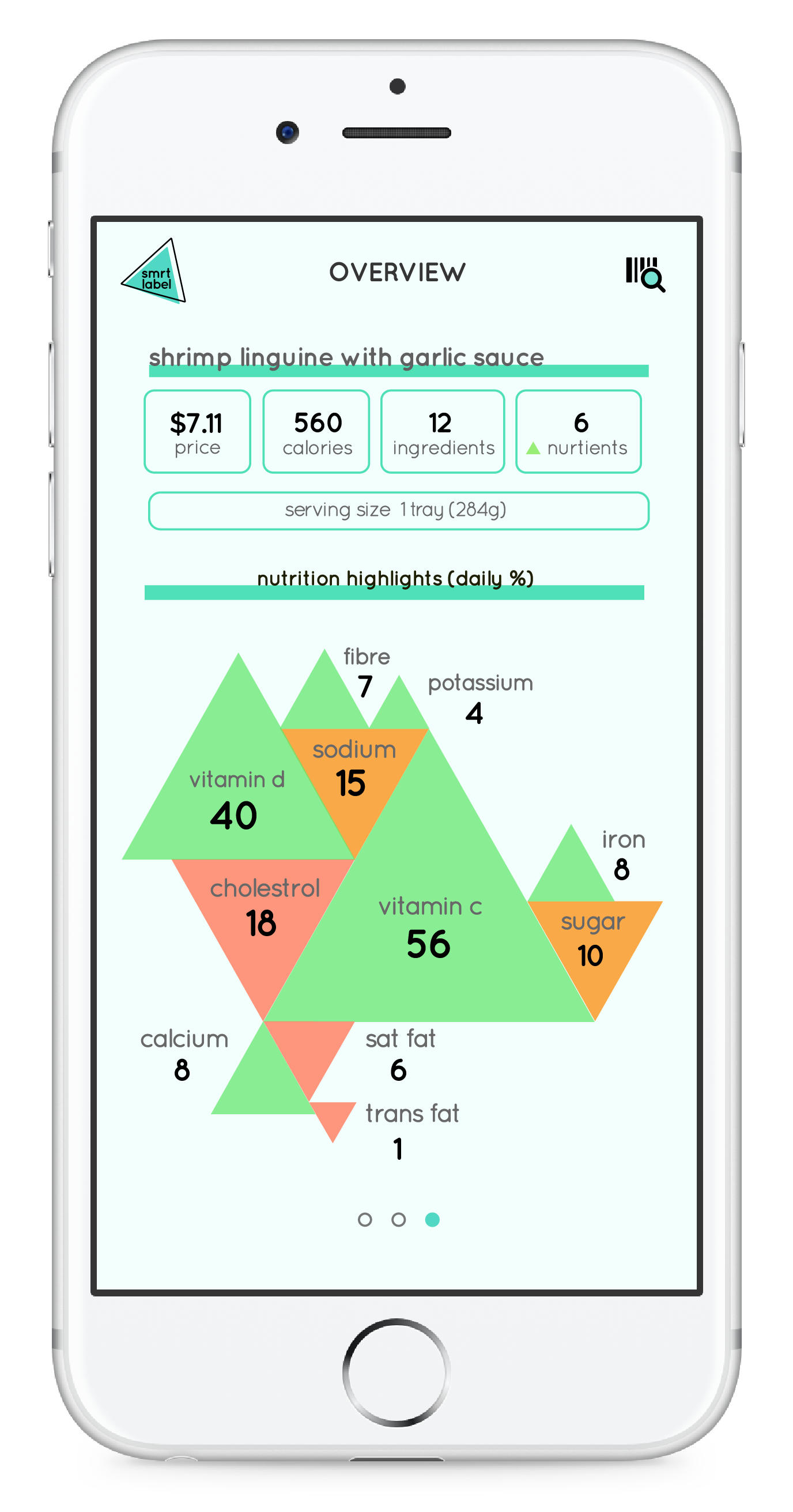
OVERVIEW
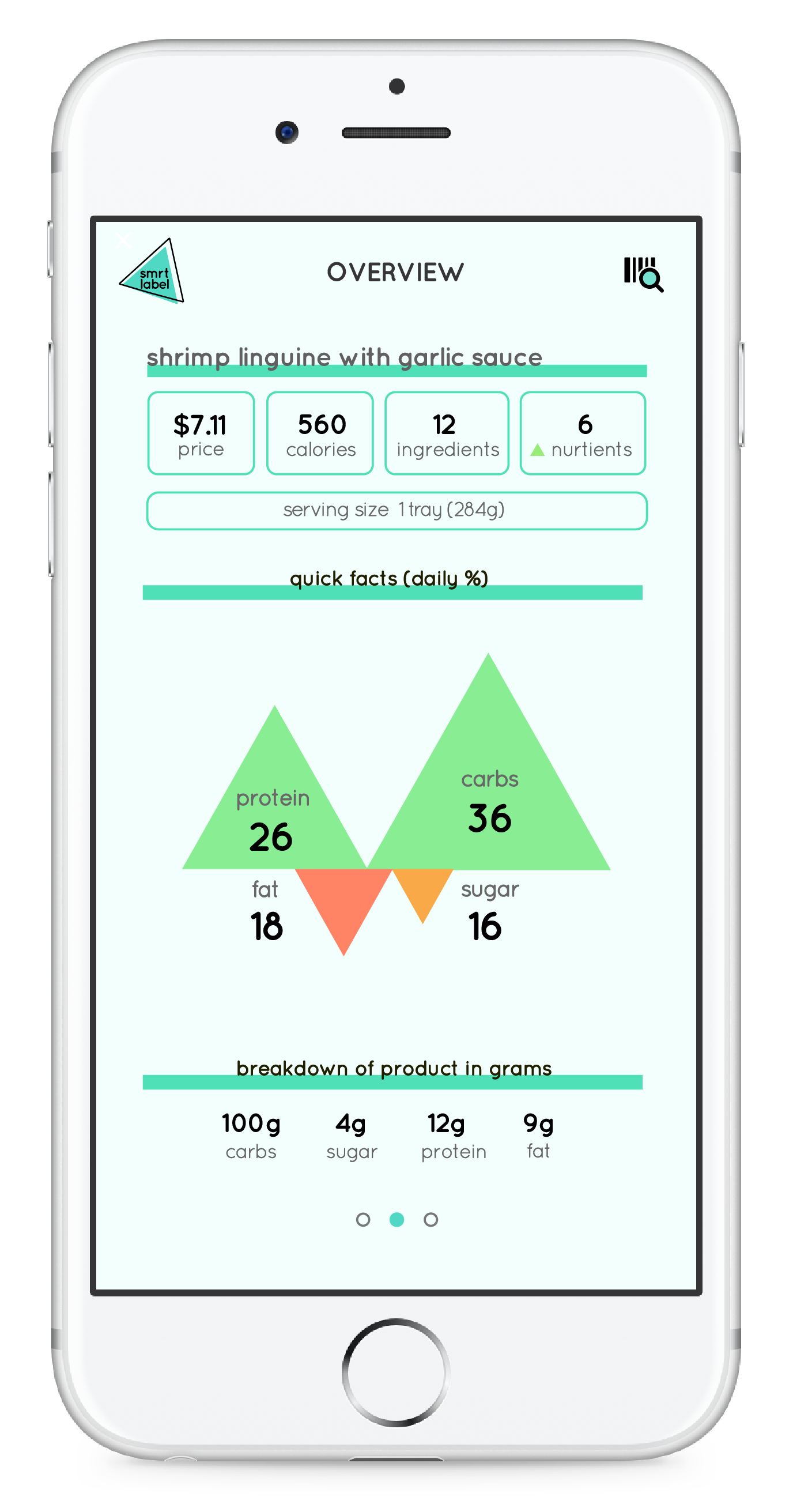
This will then take them to the overview of the product where the user can check the price, calories, ingredients and amount of good nutrients. When they swipe to the right, it will reveal the macronutrients of the product and the breakdown of the product in grams. When the user swipes again to the right, it would reveal an in-depth breakdown of the micronutrients of the product.
The green coloured triangles pointing upwards represent all the nutrients that the user should get more of. The orange coloured triangles means to be cautious of the amount consumed, while the red colour suggests the user avoid eating too much of the nutrient. Each triangle is scaled proportional to the amount of nutrients measured.
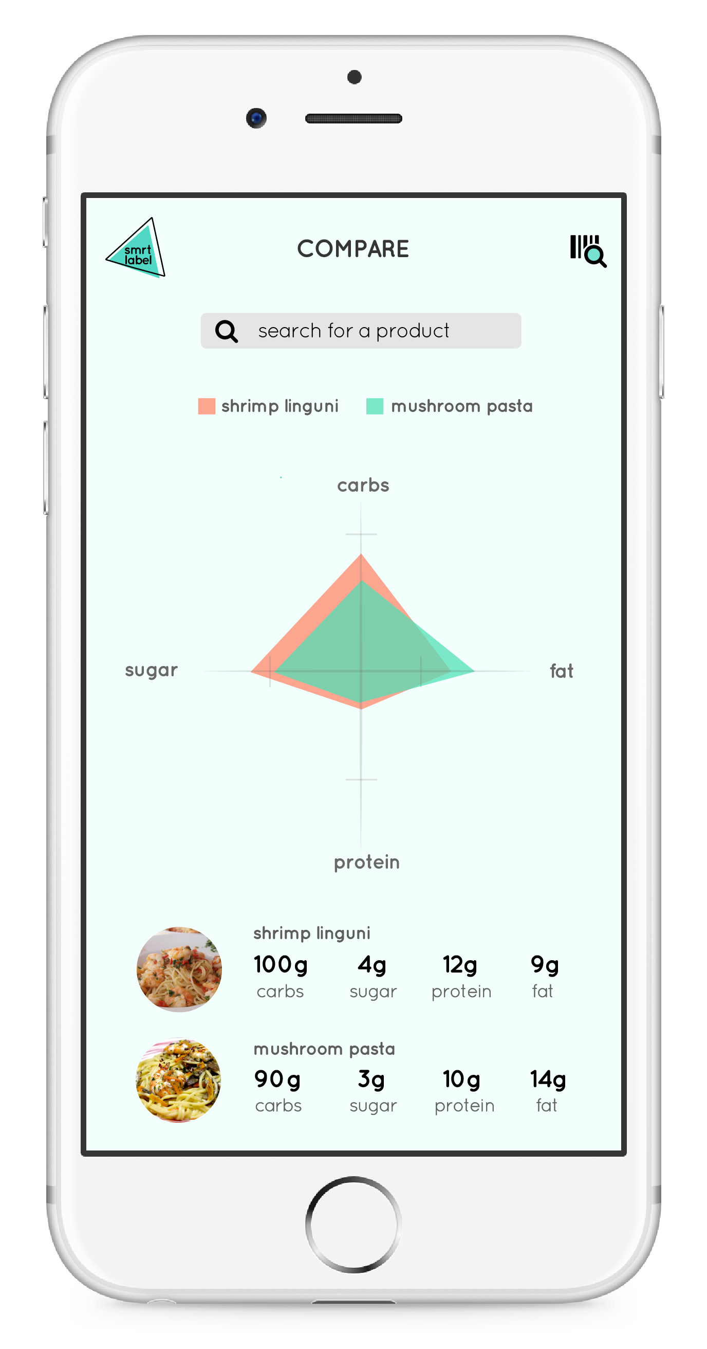
COMPARE NUTRITION
Users also have the option to compare the nutrition between different products to see which one is best suited for them.
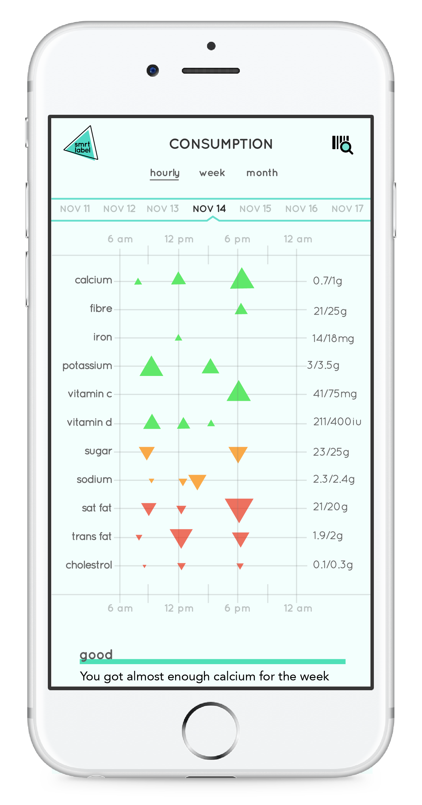
CONSUMED NUTRITION
Users can take a glance at the nutrients they consumed over the day, week and month. The charts help to visualize the quantity of each nutrient and how much the user should take.
Outcome Reflection
This project has taught me a lot about pushing my boundaries as a designer. I learned to come up with unique concepts to visualize the data instead of sticking with the norm. It was challenging to fit some of the information the way I envisioned it to be. In the future, I would like to create an onboarding for my product, as it might be confusing for first time users. I would also like to try prototyping it in a different program, such as Flinto.
HELLO THERE!
My name is Gillian Wu and I am currently in my third year studying at the York Sheridan Design program. I believe design and aesthetics are only powerful when they communicate a substance in an effective way. Good design looks visually pleasing, but great design comes from the result of critical thinking and lots of failed attempts.
EXPERIENCE
- Social Markt - 2016
- The Real Estate Office - 2016
EXTRACURRICULARS
- RU Hacks - 2017
- Design Jam - 2016
- YSDN: The Intermission - 2016
I am currently looking for internship opportunities to expand my skills as an emerging designer. Feel free to send me a message!