
The Problem
Many major tampon brands have unnecessary frills and flourishes on their packages, denoting female clichés. They are often contained in lackluster boxes that can be difficult to carry around on the go.
The Solution
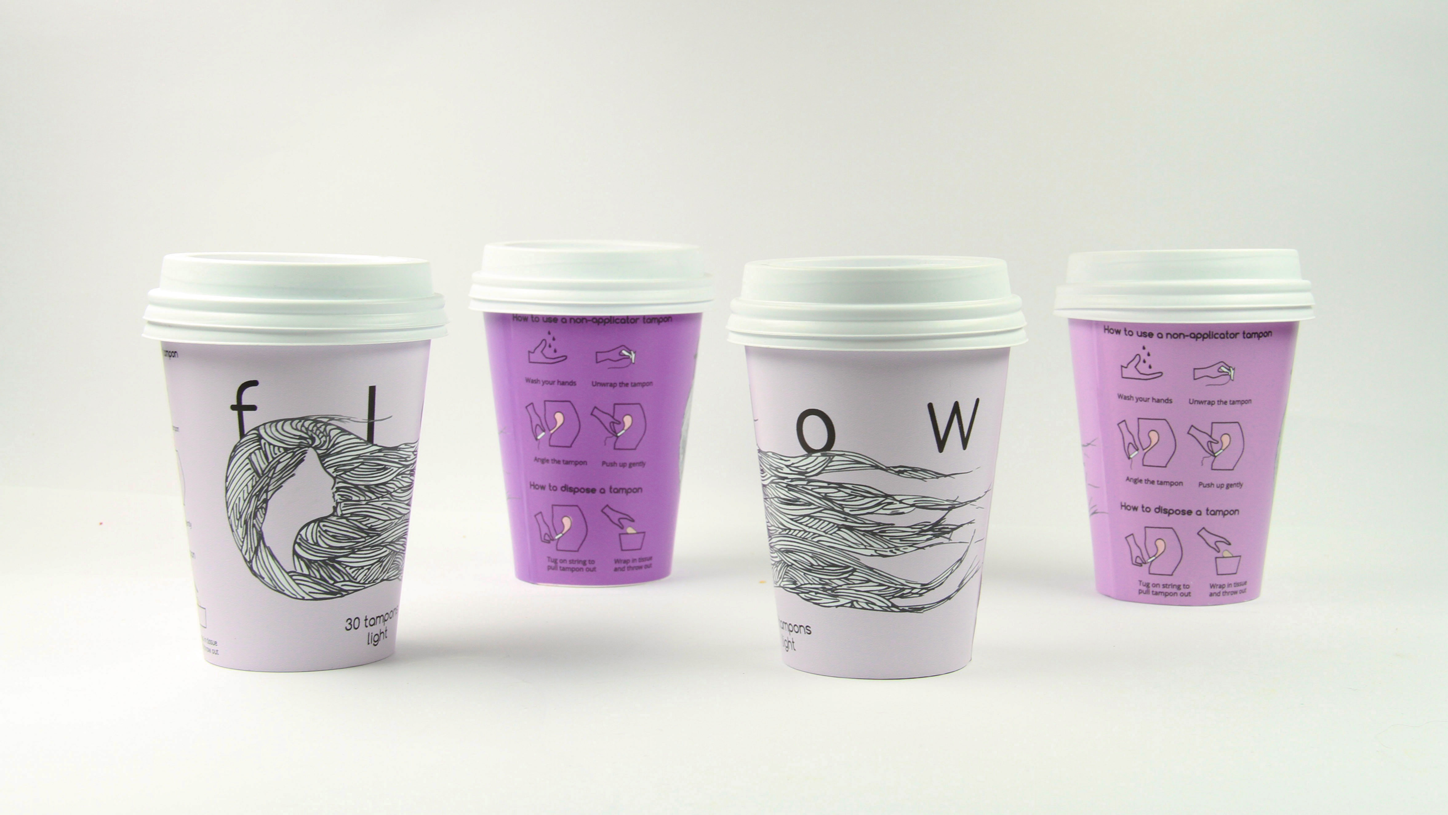
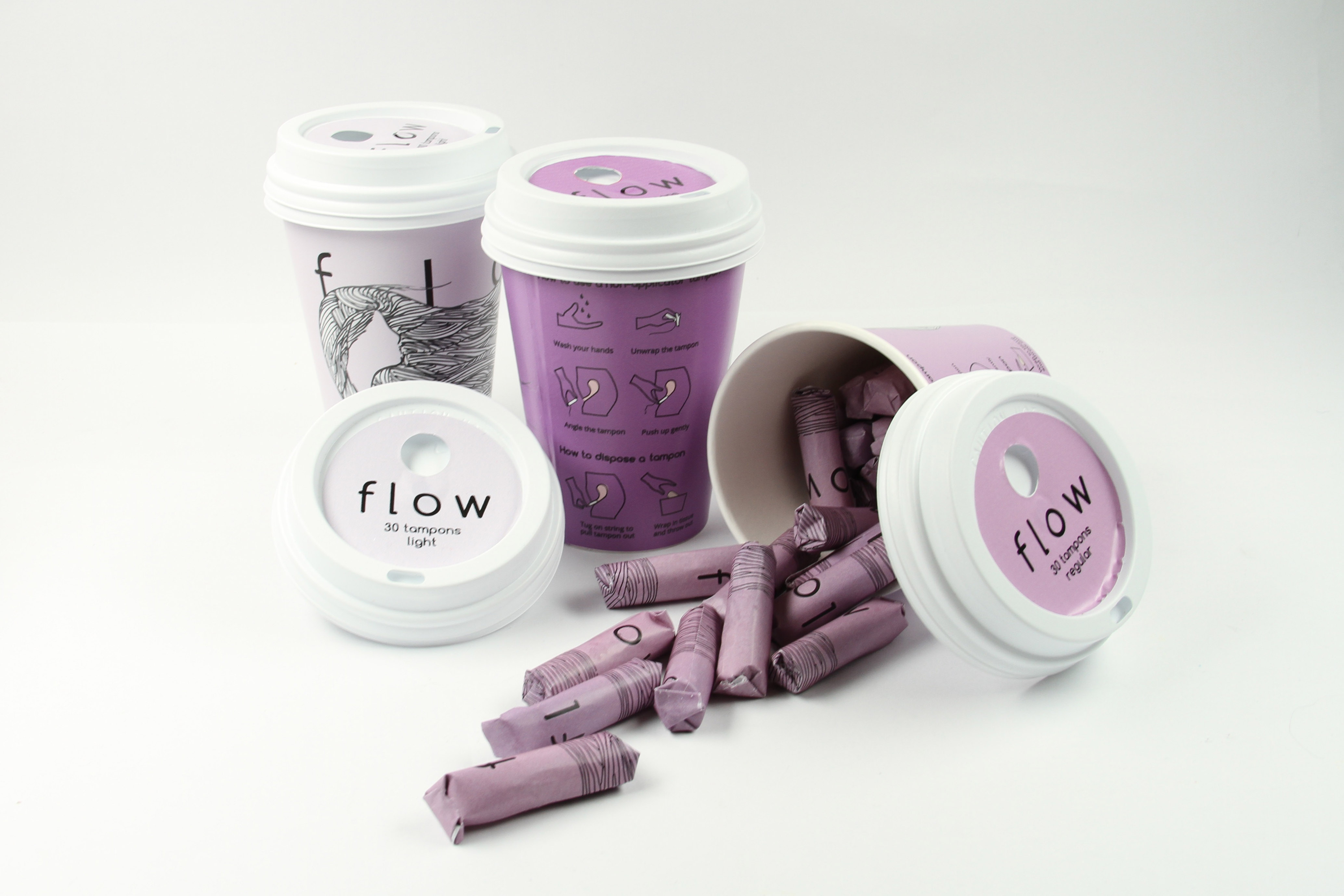
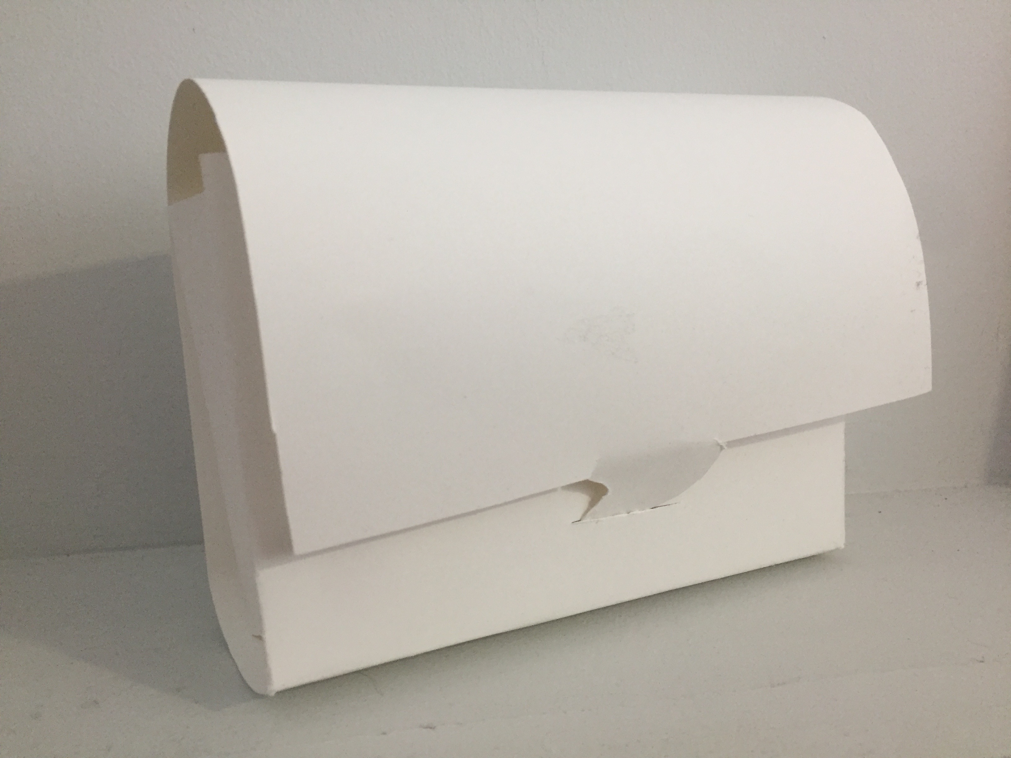
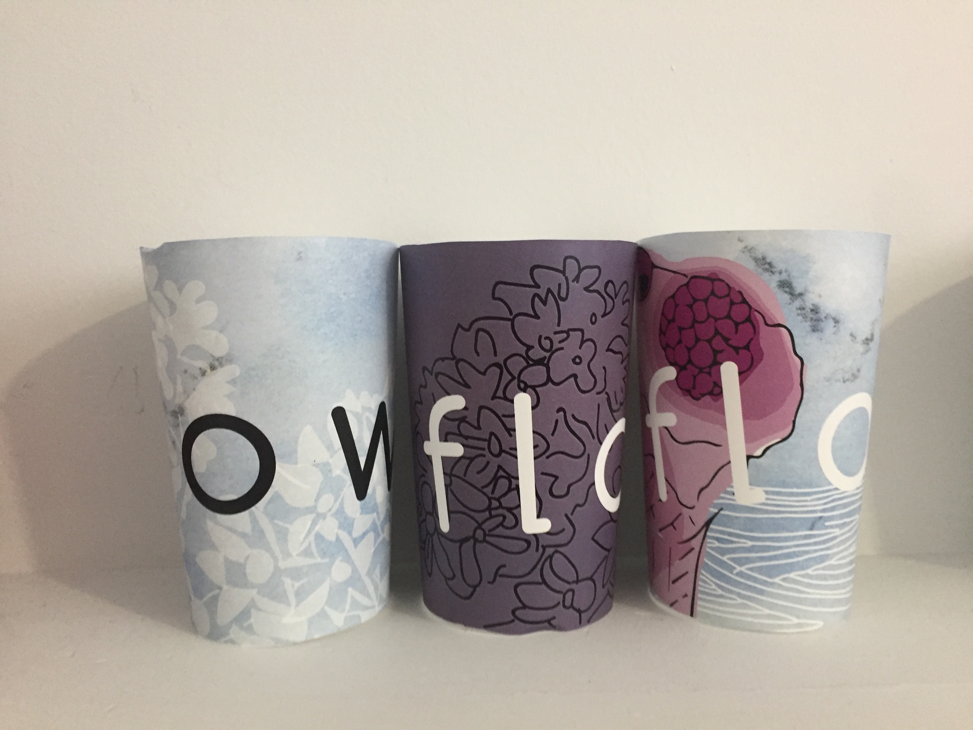
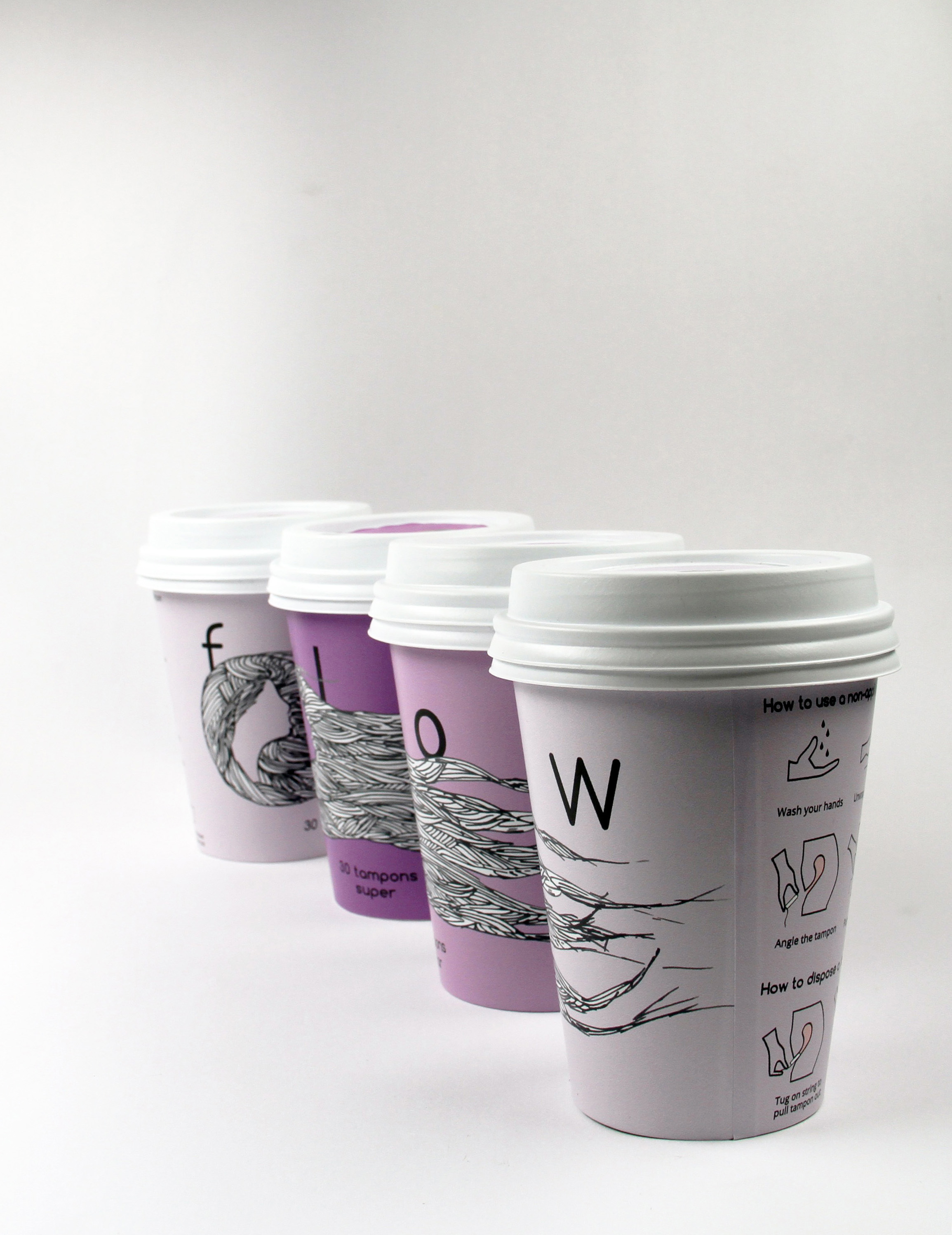
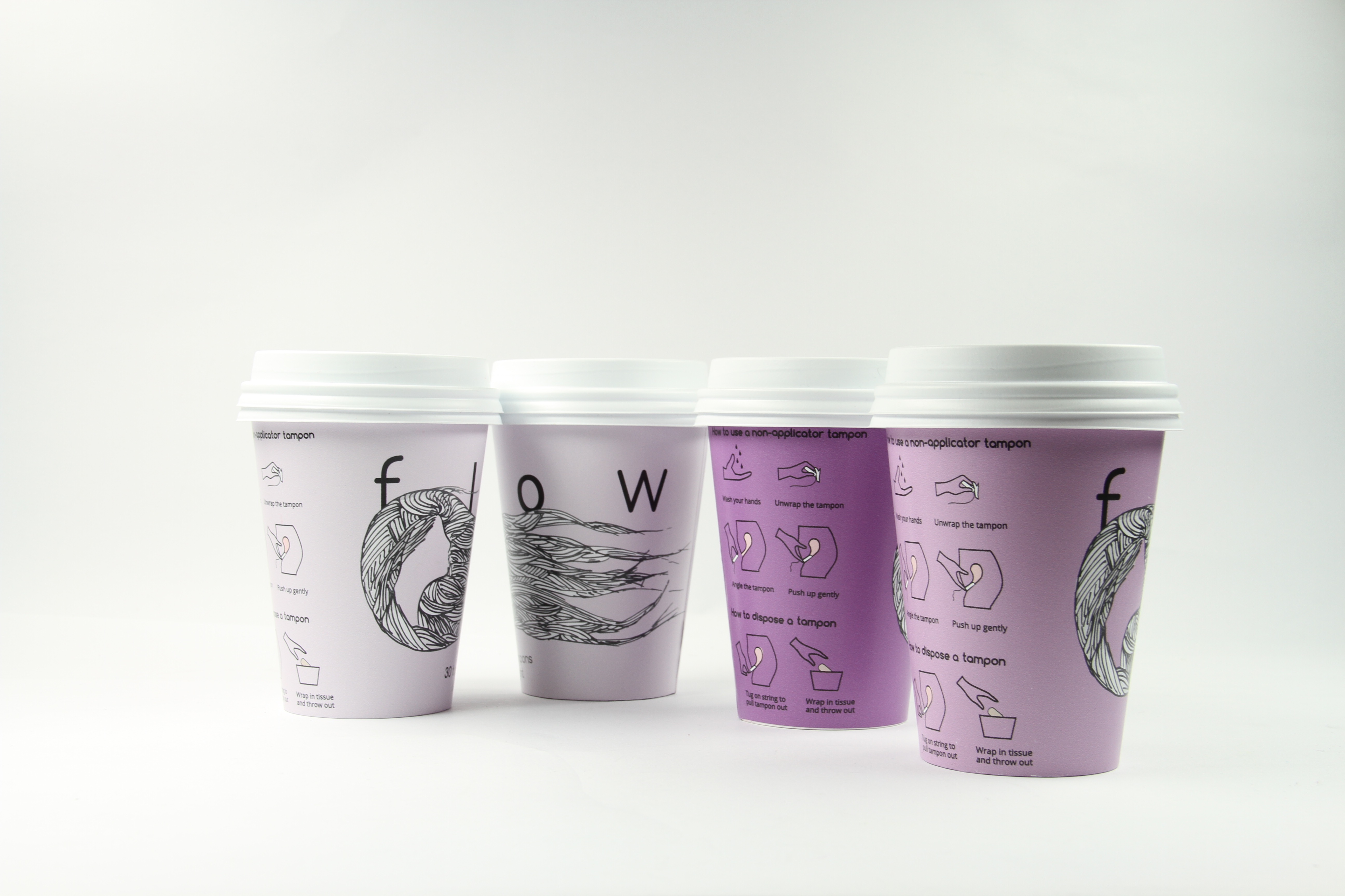
Flow is a product that puts a unique spin on how tampons are packaged. The goal of this design was to make buying tampons as simple and easy as ordering a cup of coffee. I wanted to utilize the shape of a coffee cup to contain the tampons in, while having the lid act like a dispenser for easy access.
The Research
TARGET AUDIENCE
The target audience is geared to females between the ages of 13 to 23. I wanted to focus on young adults because purchasing feminine hygiene products can be awkward sometimes. Through my design, I hope to change the perception surrounding the menstrual cycle, tackle the taboos and make it feel normal to buy tampons.
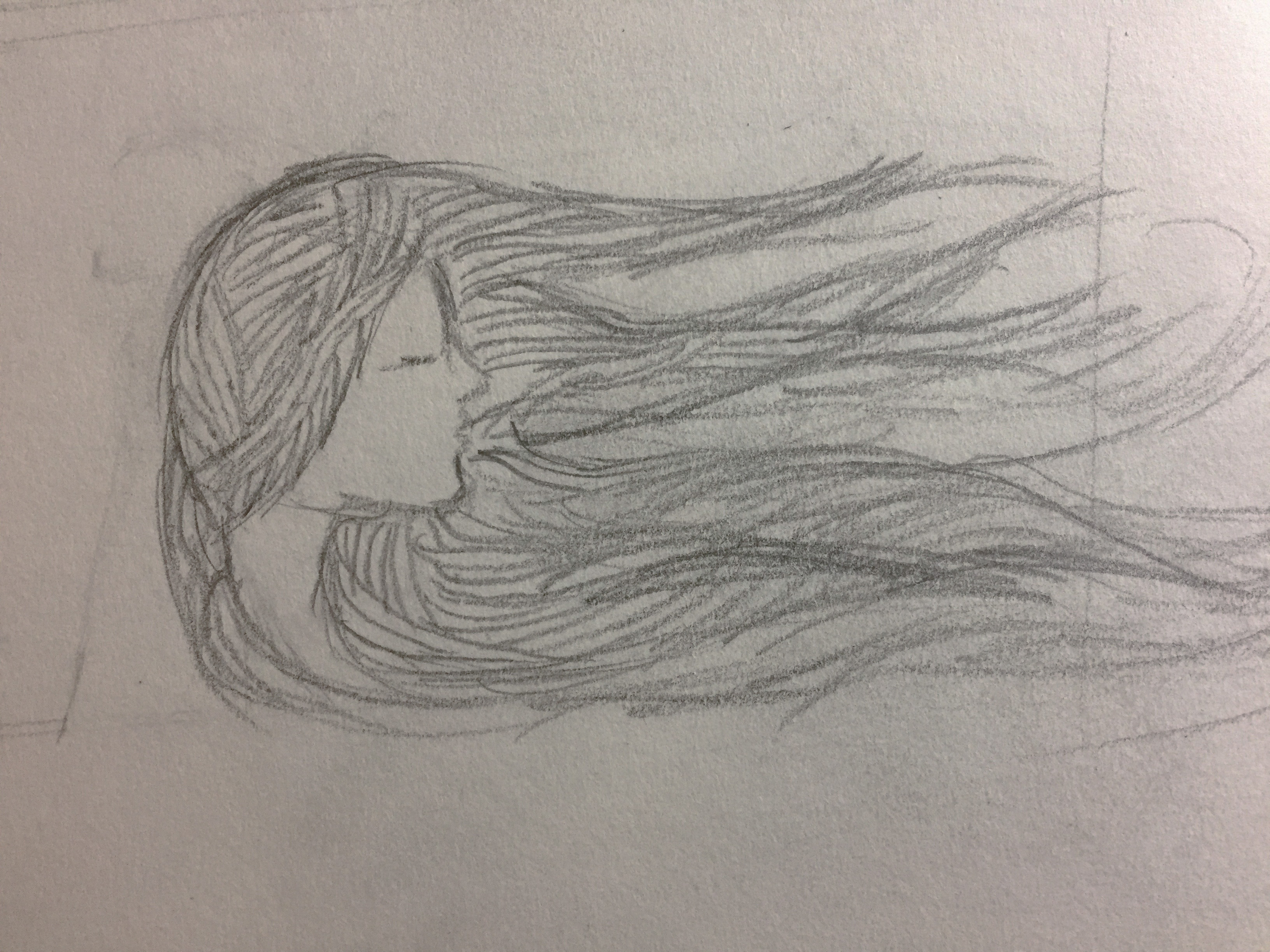
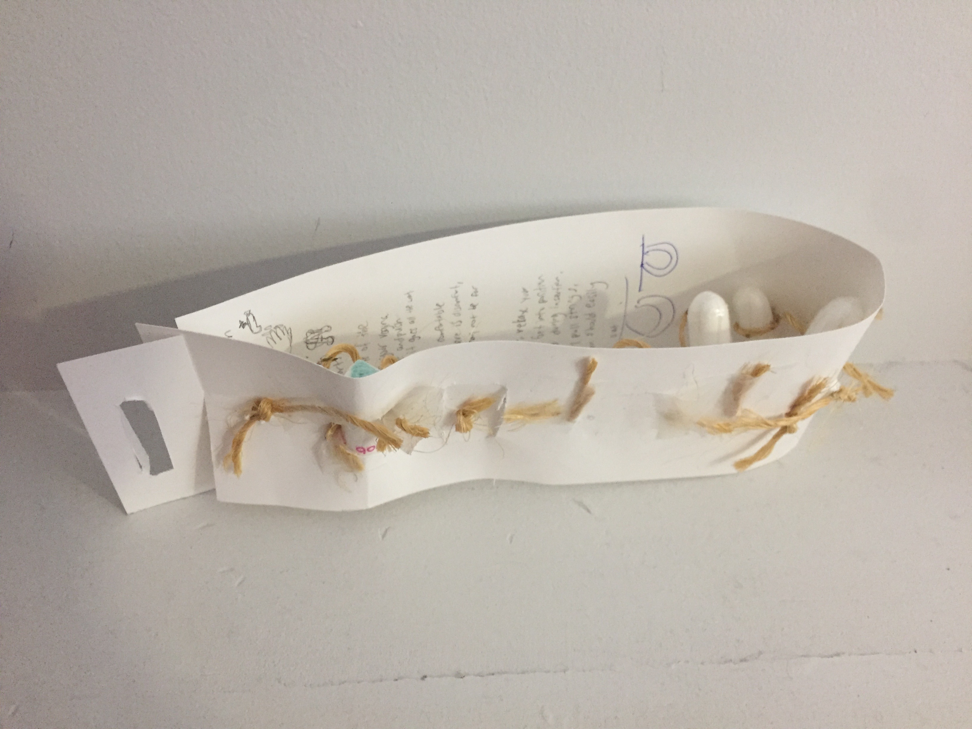
PROCESS
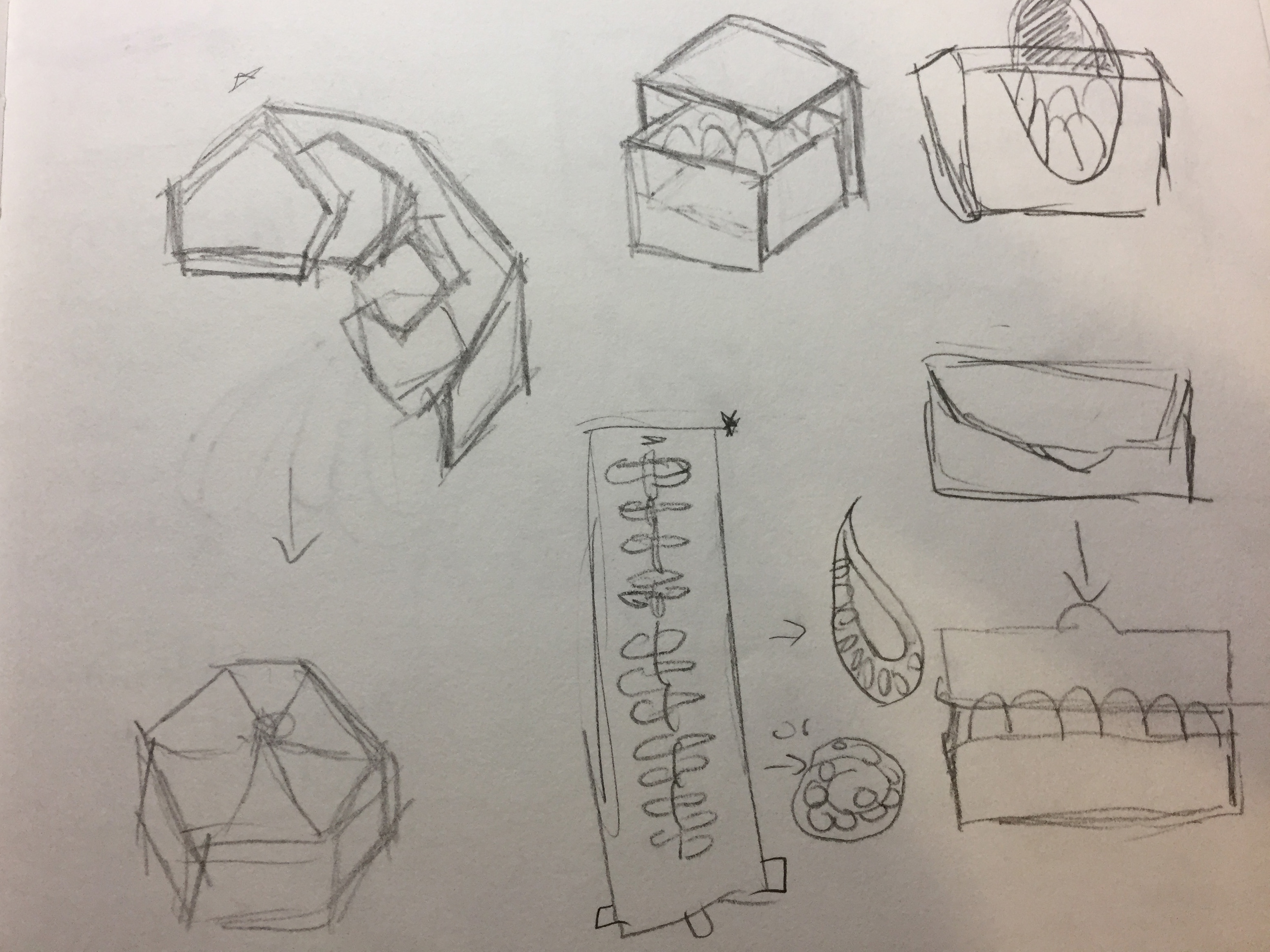
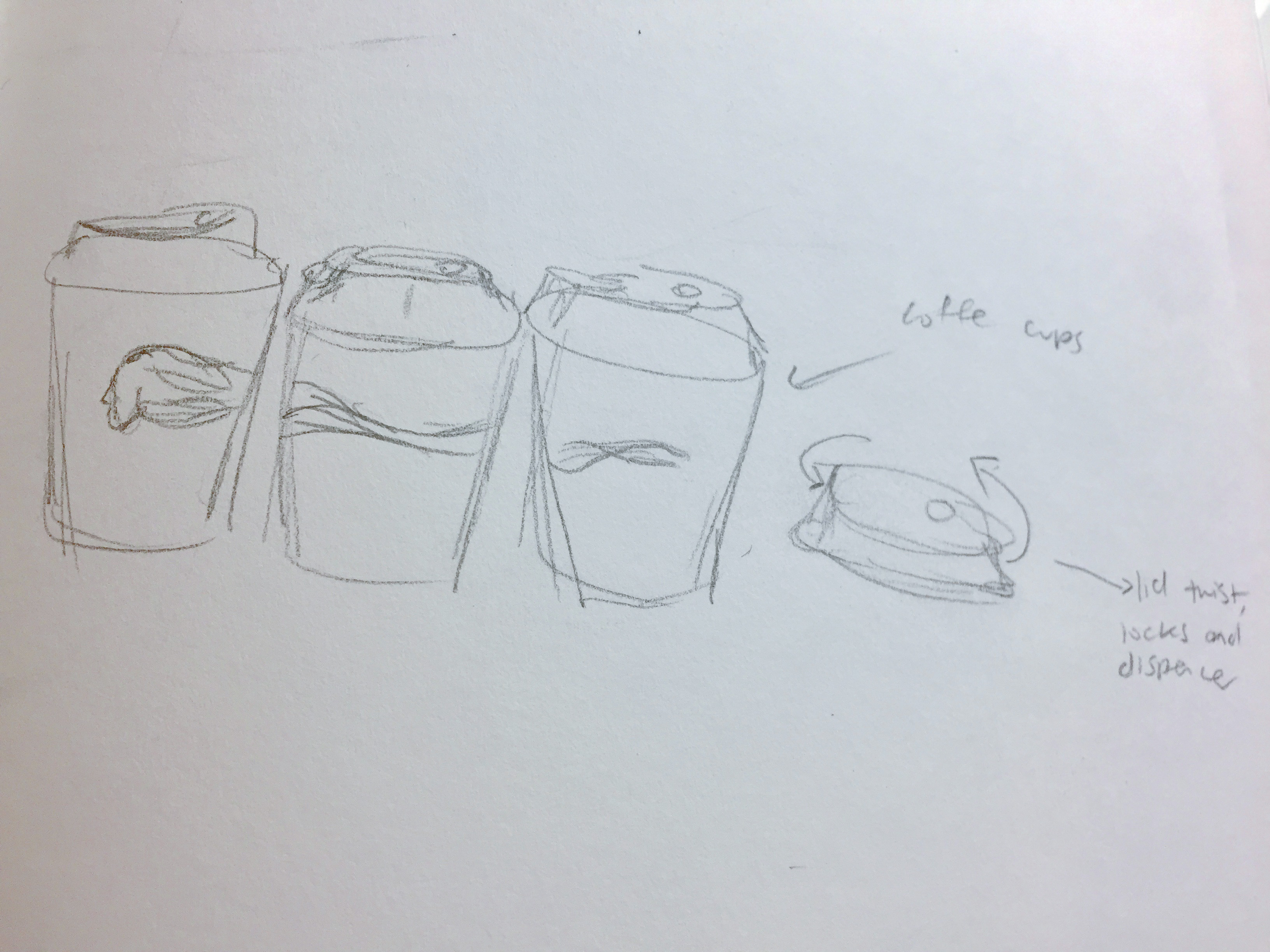
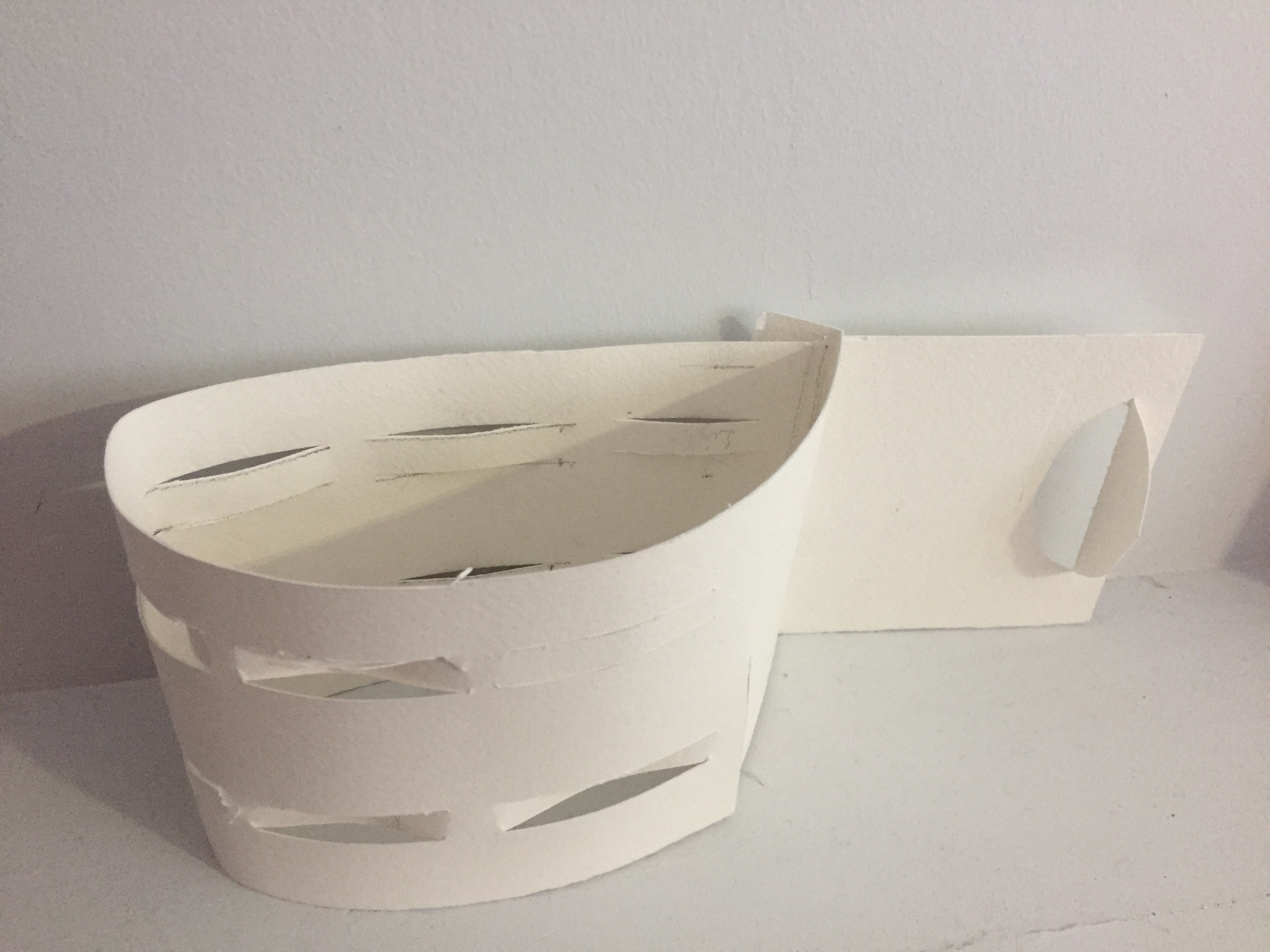
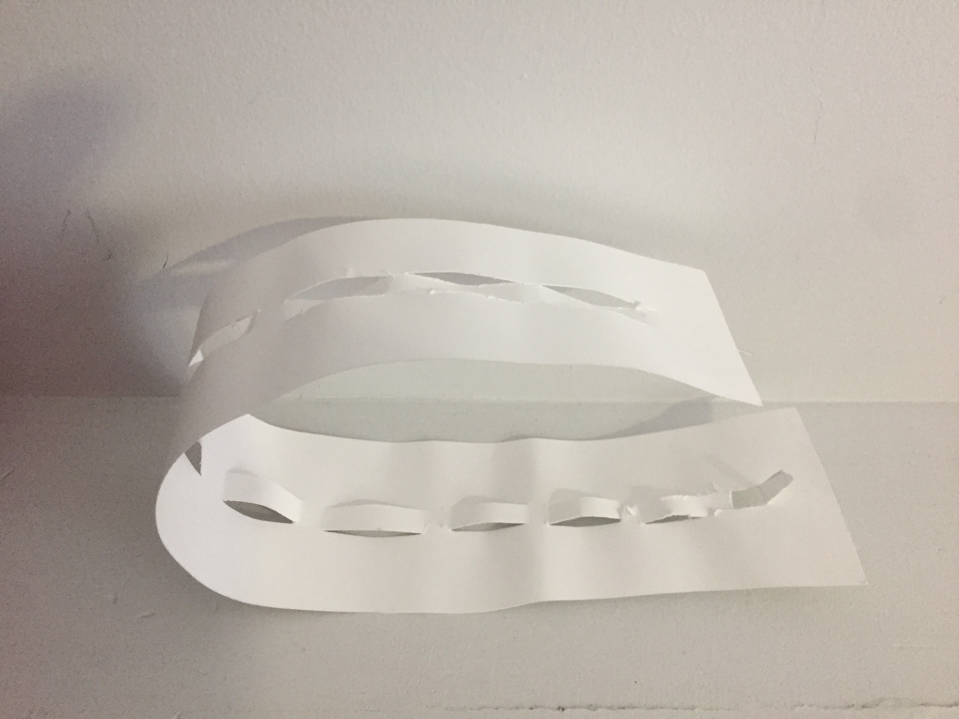
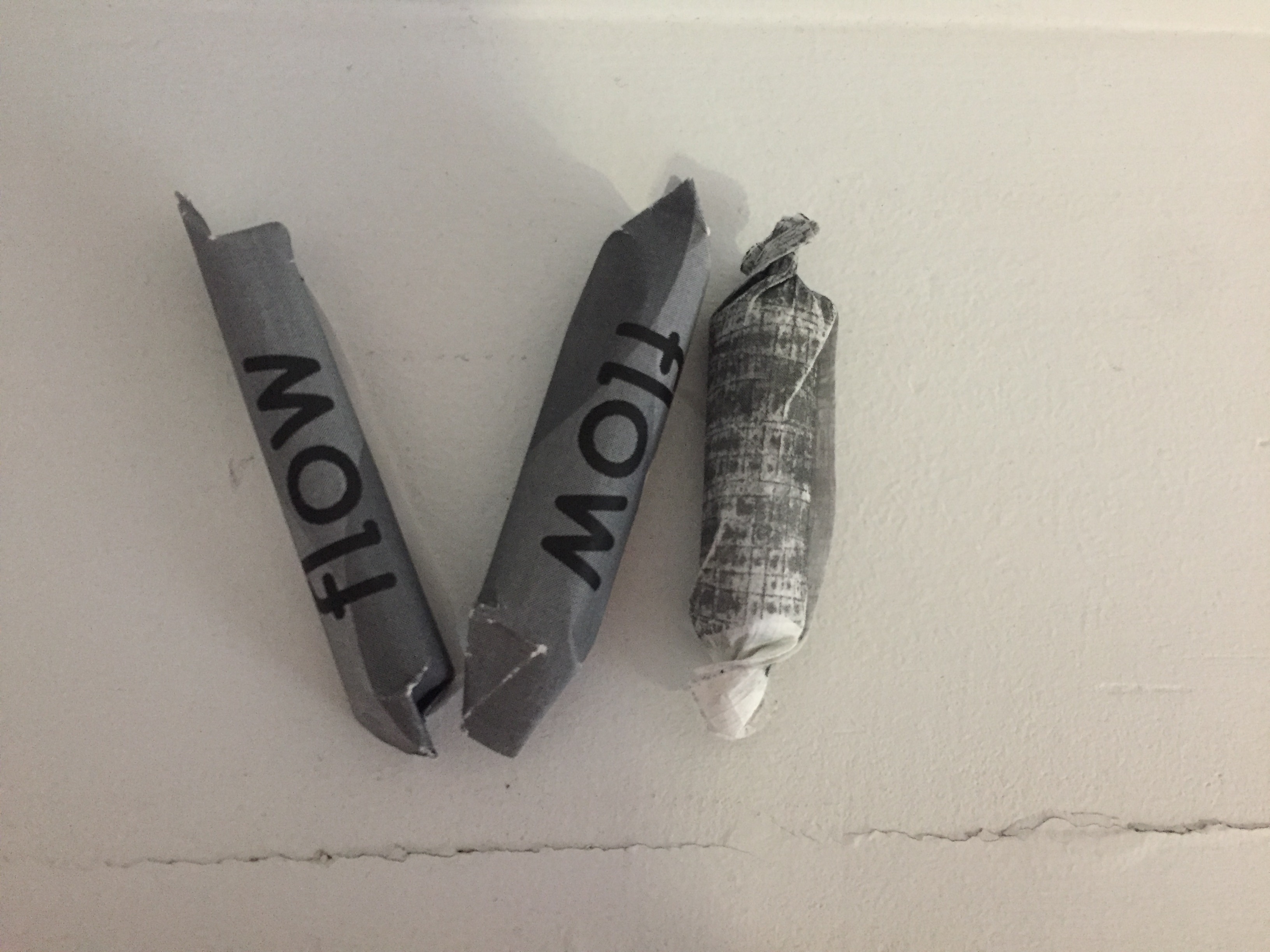
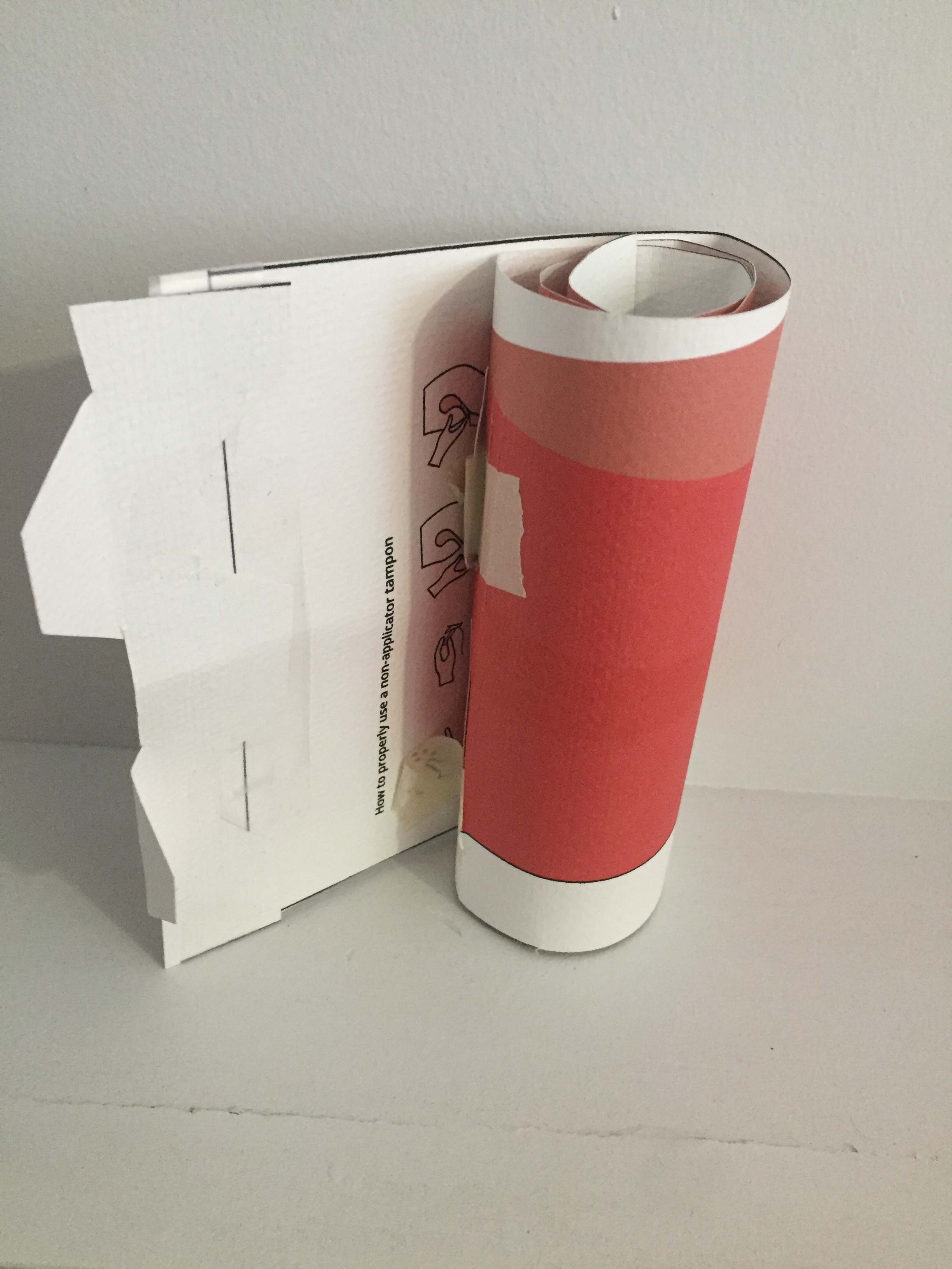
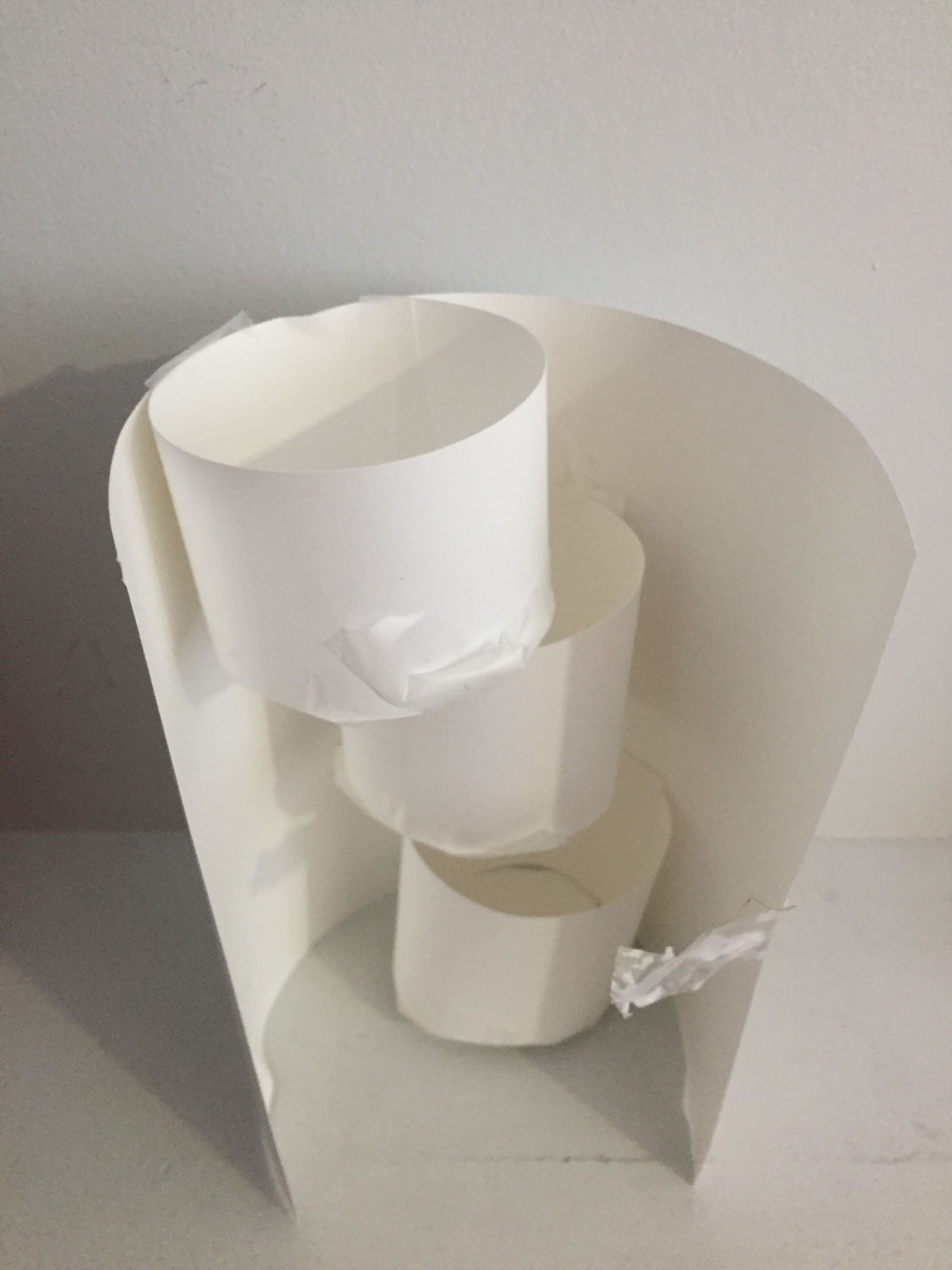
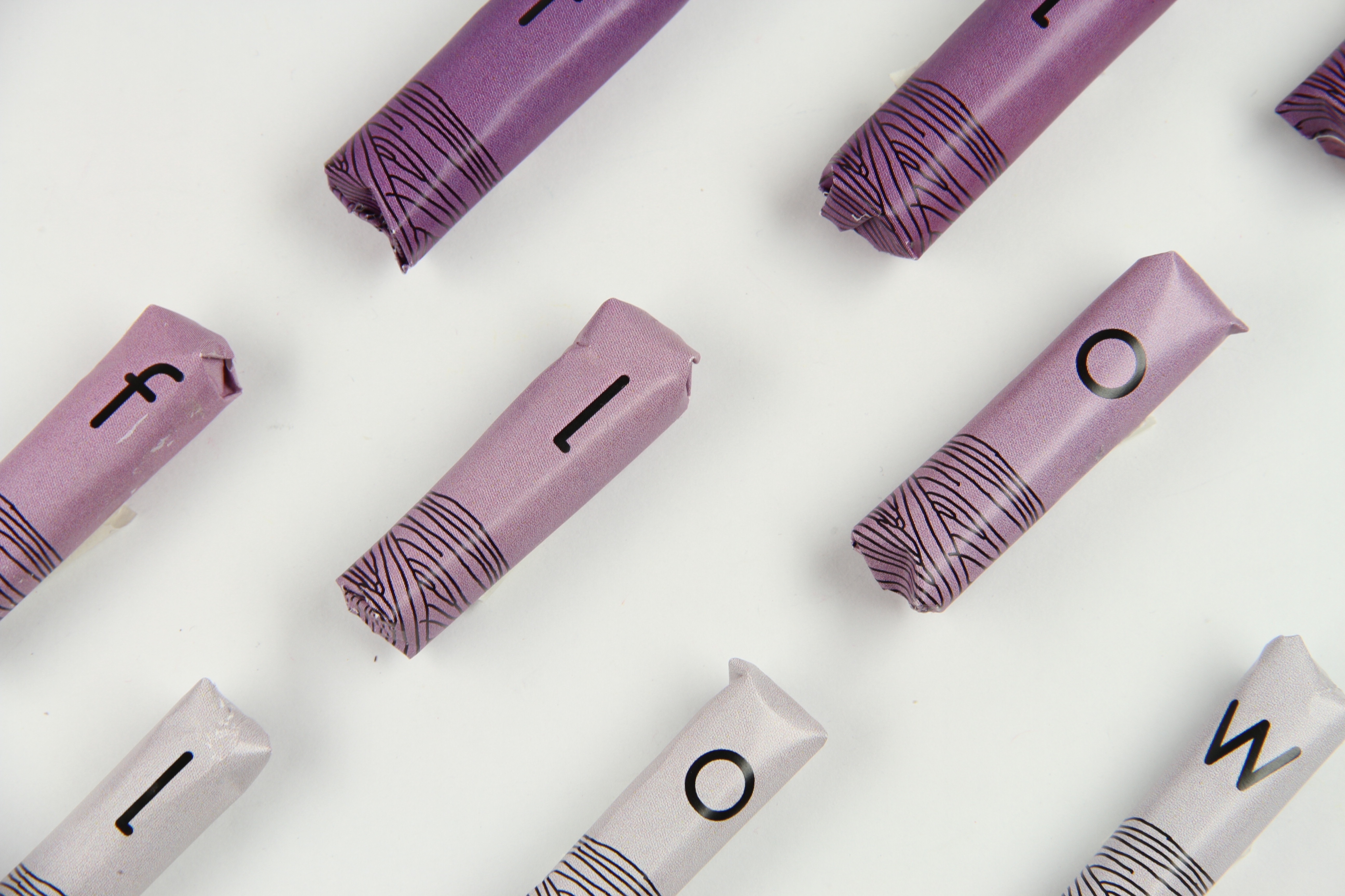
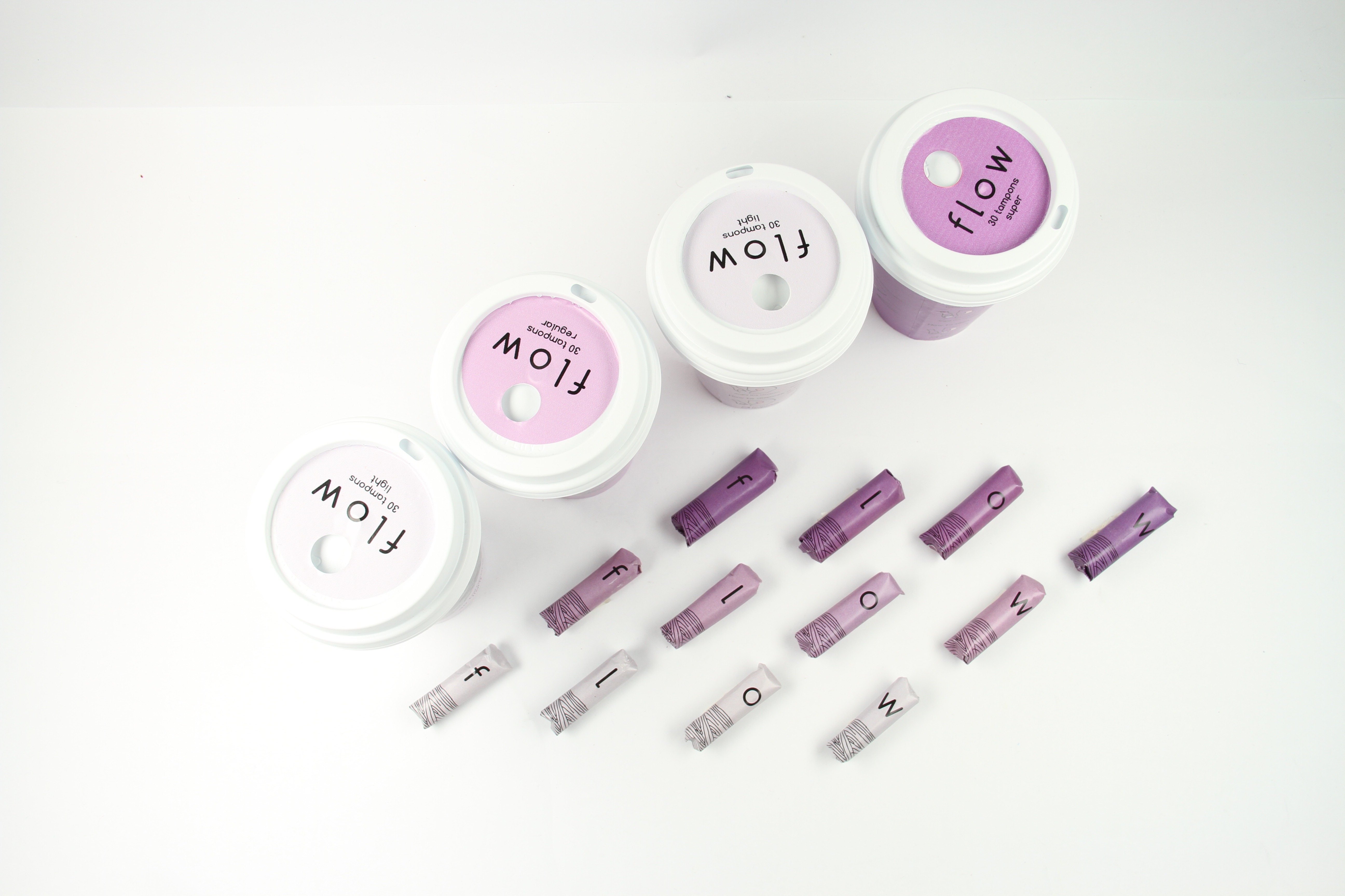
The first thing I did was sketch out ideas on paper and gather sources of inspiration from places like Pinterest. I then developed and refined a few different prototypes before I came up with the final design. My original intention was to create a container with slots that each tampon can fit in. This method would be simple and would not need much glue. Unfortunately, despite major revisions, I realized it was unhygienic and had to change my idea. I also tried to come up with different types of branding and colour variations for the product. In the end, I settled for the name ‘flow’ because it denotes menstruation.
Final Product
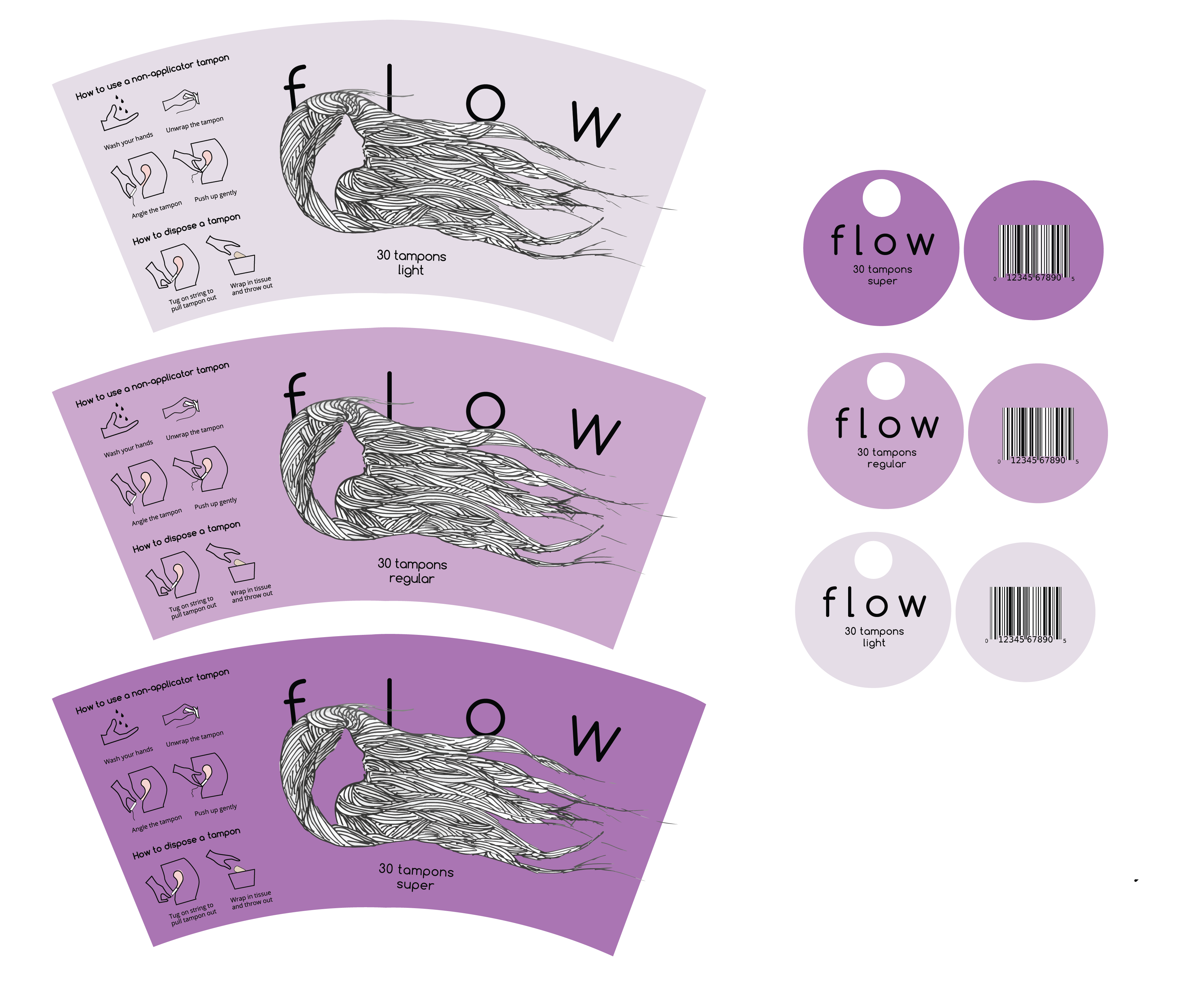
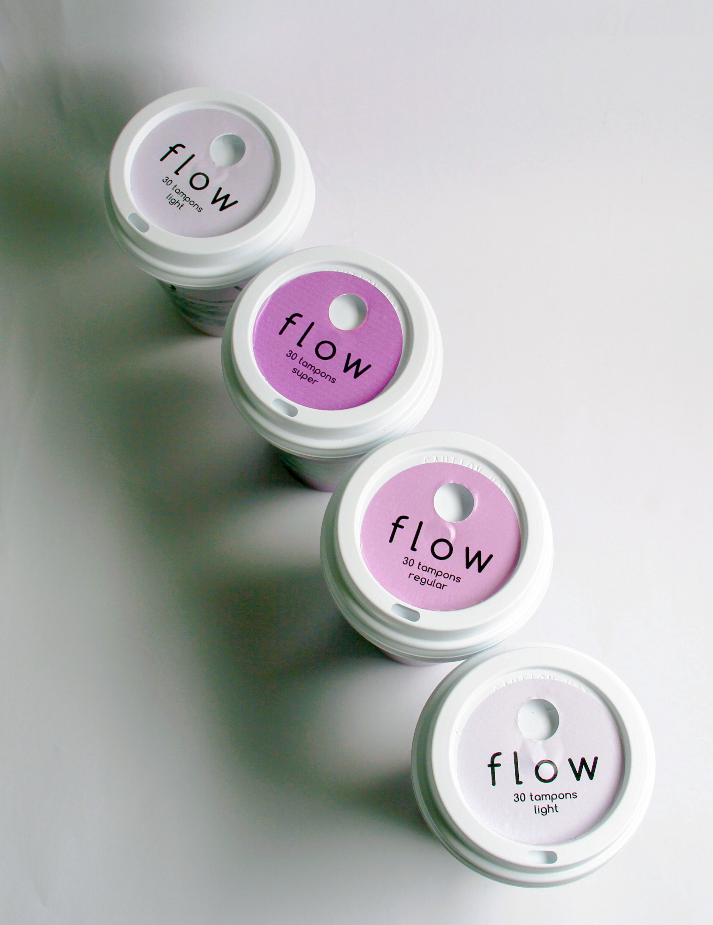
Flow is user-friendly and easy to carry around because it is shaped like a coffee cup. The lid dispenses the tampons and can be rotated to open or close the container. There are three shades of purple, which represents different tampon absorbencies. Purple is the main colour of the brand, which symbolizes dignity and independence. It helps to uplift the user’s mood and calms the mind. The three shades of purple represents a different absorbency of the tampon. The lighter the purple is on the package, the smaller the tampon is in diameter and height. In addition, the main typeface that was used on the package is Comfortaa. It was chosen because the typeface was soft and subtle in nature, which makes the package look more relaxing. The package comes in three different sizes (light, regular and super) to suit the flow level.
Outcome Reflection
In this project, I learned the importance of keeping an open mind and try different variations of design. While I was given eight weeks to do the project, I struggled a lot on making the package work. In the end, I realized I could not stick with my original concept and had to change my ideas a week and a half before it was due. I managed to redo my entire package in a short amount of time. In the future, I would like to future improve on my package by improving the branding and making the tampon wrappers more unique.


HELLO THERE!
My name is Gillian Wu and I am currently in my third year studying at the York Sheridan Design program. I believe design and aesthetics are only powerful when they communicate a substance in an effective way. Good design looks visually pleasing, but great design comes from the result of critical thinking and lots of failed attempts.
EXPERIENCE
- Social Markt - 2016
- The Real Estate Office - 2016
EXTRACURRICULARS
- RU Hacks - 2017
- Design Jam - 2016
- YSDN: The Intermission - 2016
I am currently looking for internship opportunities to expand my skills as an emerging designer. Feel free to send me a message!