Product Design | Web & Mobile
Travel App
Travel App
Making it easier for travellers to organize and plan their trips.
Making it easier for travellers to organize and plan their trips.
Role
UX Research
Ideation
Wireframing
Project Type
Design Challenge
Web & Mobile
Tools
Sketch
Paper and pen
Team
Team
Sole Designer
Duration
6 days
Dec 2019
Nov 2020 - Aug 2021
Overview
Overview
This is a travel application I designed in six days for a design challenge. I chose this subject because I am an avid traveller and organizing my itinerary was tedious sometimes. After I completed the wireframes in December, I spent a bit more time to improve and refine my designs.
This is a travel application I designed in six days for a design challenge. I chose this subject because I am an avid traveller and organizing my itinerary was tedious sometimes. After I completed the wireframes in December, I spent a bit more time to improve and refine my designs.
Problem
There are many different methods and steps involved when a traveller plans a trip. Many people use Trello, Google Sheets, and Google Docs to organize their vacation. Staying within budget can also be tough to manage when there are various activities travellers want to part-take in.
Challenge
Challenge
How might we design an easier way for travellers to plan and organize their adventures while staying within their budget?
Solution
Solution
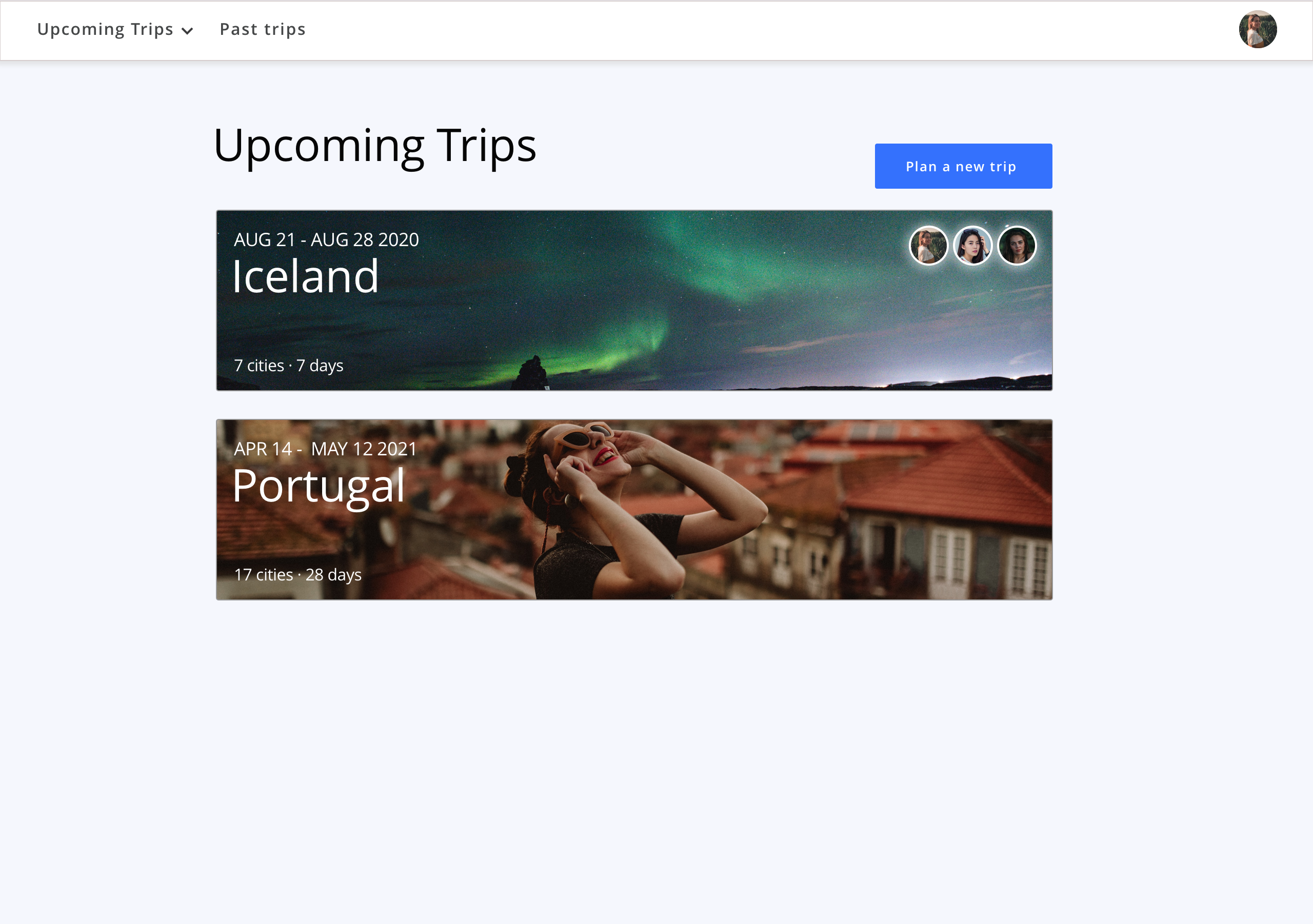
Create an all in one platform that allows travellers to plan their trip, organize locations they want to go to and keep track of their budget.
Research
Given the short time duration, I decided to spend two days doing research. I took the time to look at products that are already in the market, skim through Quora, Reddit, and Facebook community groups, conduct a 1-1 interview and go through my past itineraries.
Secondary Research
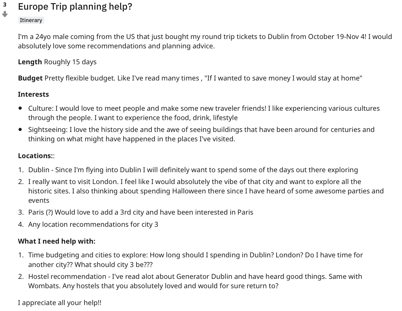
The most accessible content online was forums and community groups. I decided to do some observational research.
People were always looking to get feedback and input on their travel itineraries from the community. They ask for advice and recommendations about their overall trip and accommodations.
Strengths
- Community focused
- Different opinions
- Casual and friendly
Weaknesses
- Users do not know the person answering
- Replies and answers are not always helpful or useful
- Extensive research and itinerary ideally compiled before posting
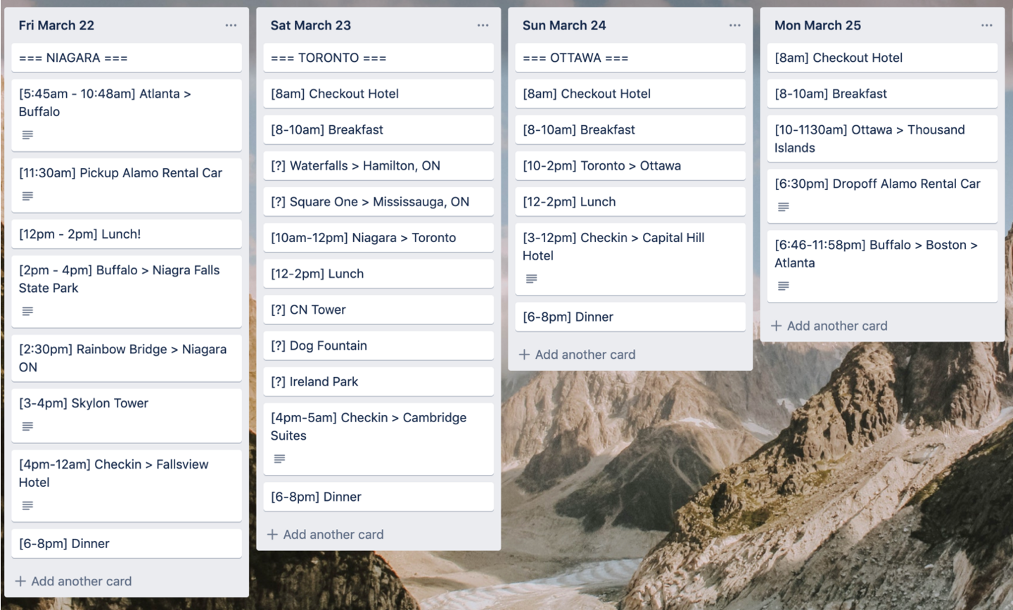
Trello
Some people use Trello to organize their vacation plans because of its versatility.
Strengths
- Easy to navigate through each day
- Can see the entire trip from a wide lens
- Quickly move cards around or change locations of interest
- Trello board is sharable with friends and family
- Ability to attach documents
Weaknesses
- No way to calculate budget
- Not designed for the traveller in mind
- Lack of hierarchy can make it feel overwhelming
Google Sheets
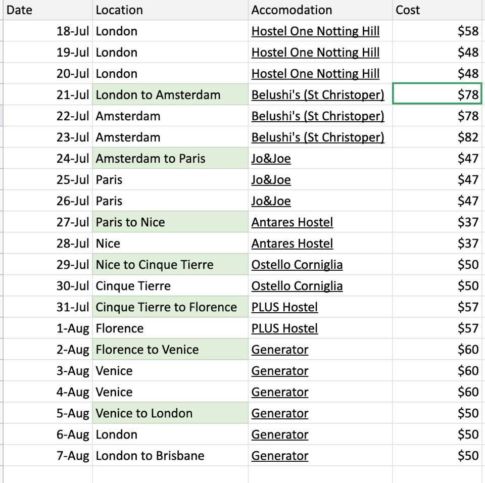
The image below shows the budget and accommodation plan for a traveller. She posted it on a Facebook group to ask for feedback on her itinerary.
Strengths
- Easy to organize
- Can see the big picture
- Easily highlight important information
- Document sharable with friends
- Easy to calculate and crunch budget numbers
- Easy to organize
- Can see the big picture
- Easily highlight important information
- Document sharable with friends
- Easy to calculate and crunch budget numbers
Weaknesses
- Only works with internet connect
- No offline map
- No ability to attach images or documents
Google Docs
Google Docs
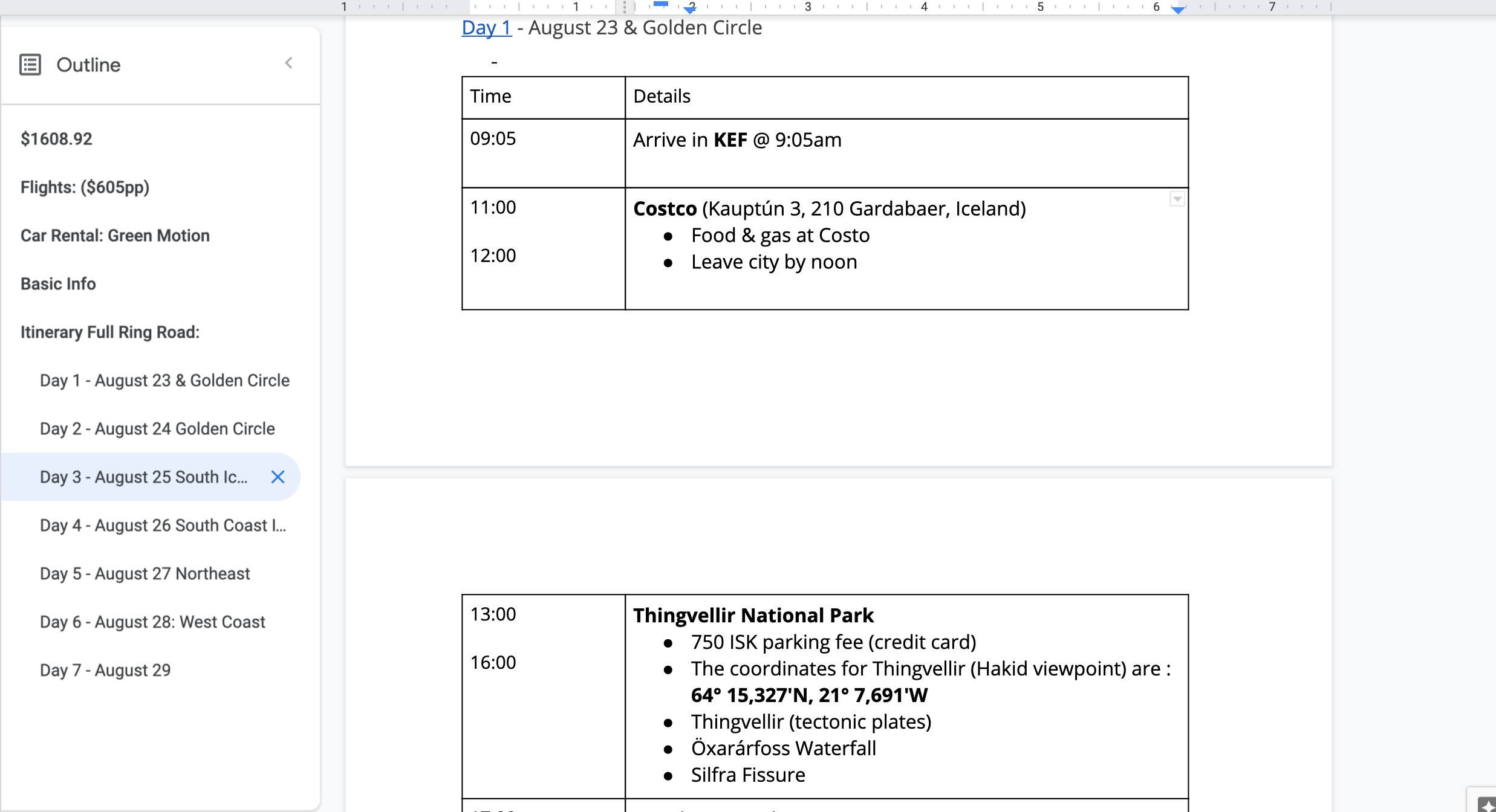
I looked back at my Iceland itinerary that I planned with my friends.
I looked back at my Iceland itinerary that I planned with my friends.
Strengths
Strengths
- The outlined sections can be easy to navigate
- Easy sharing with friends
- Ability to attach screenshots
- The outlined sections can be easy to navigate
- Easy sharing with friends
- Ability to attach screenshots
Weaknesses
Weaknesses
- Long and tedious to type everything out
- No easy way to structure the content
- No quick ways to move dates and locations around
- Not accessible offline
- Long and tedious to type everything out
- No easy way to structure the content
- No quick ways to move dates and locations around
- Not accessible offline
Primary Research
Primary Research
I decided to do a 1-1 interview with an avid traveller who just finished his trip planning for Europe.
I decided to do a 1-1 interview with an avid traveller who just finished his trip planning for Europe.
Interview Questions
Interview Questions
I created the interview questions to understand the user journey and how I can design an app that reduces friction along the way.
- Can you describe your process for the most recent trip you planned?
- What is the best part of travel planning?
- What is the worst part of travel planning?
- What type of device(s) did you use to plan your trip?
- What websites or apps did you use during your planning process?
Trip planning journey
Trip planning journey
Based off of the 1-1 interview, I mapped out his user journey as he was going through the trip planning process.
Based off of the 1-1 interview, I mapped out his user journey as he was going through the trip planning process.
User pain points, opportunities and constraints
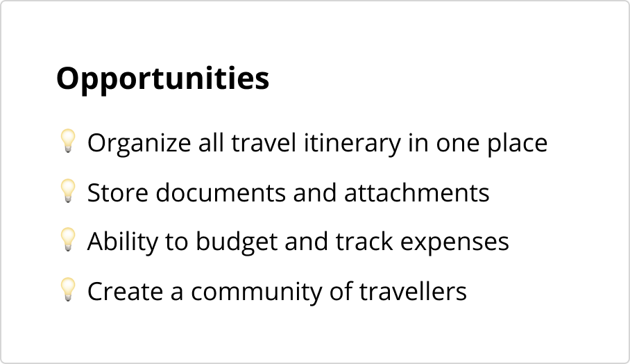
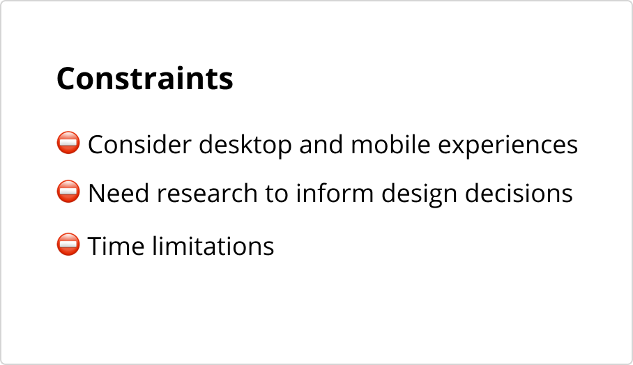
User Pain Points, Opportunities and Constraints
Two major pain points that I discovered through my research was organization and budgeting.
Two major pain points that I discovered through my research was organization and budgeting.
Ideation
Ideation
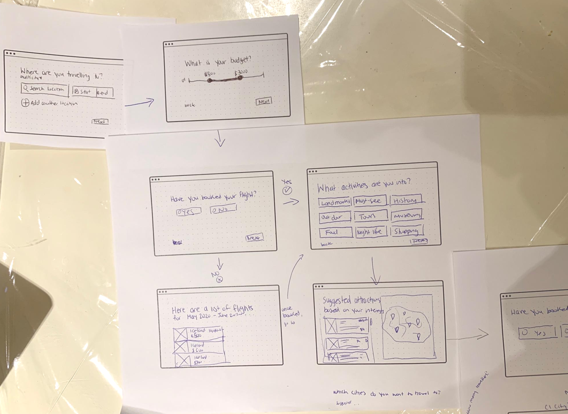
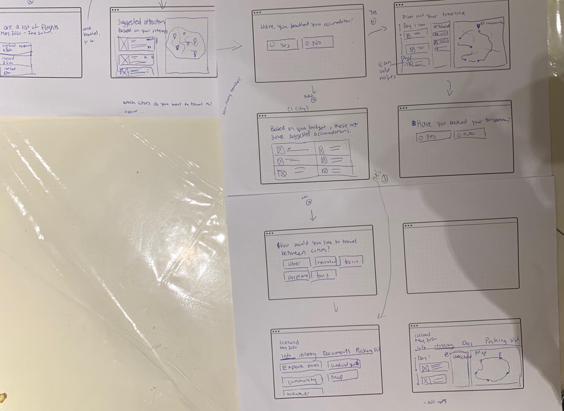
I created wireframe sketches to visualize the flow between each step.
I created wireframe sketches to visualize the flow between each step.
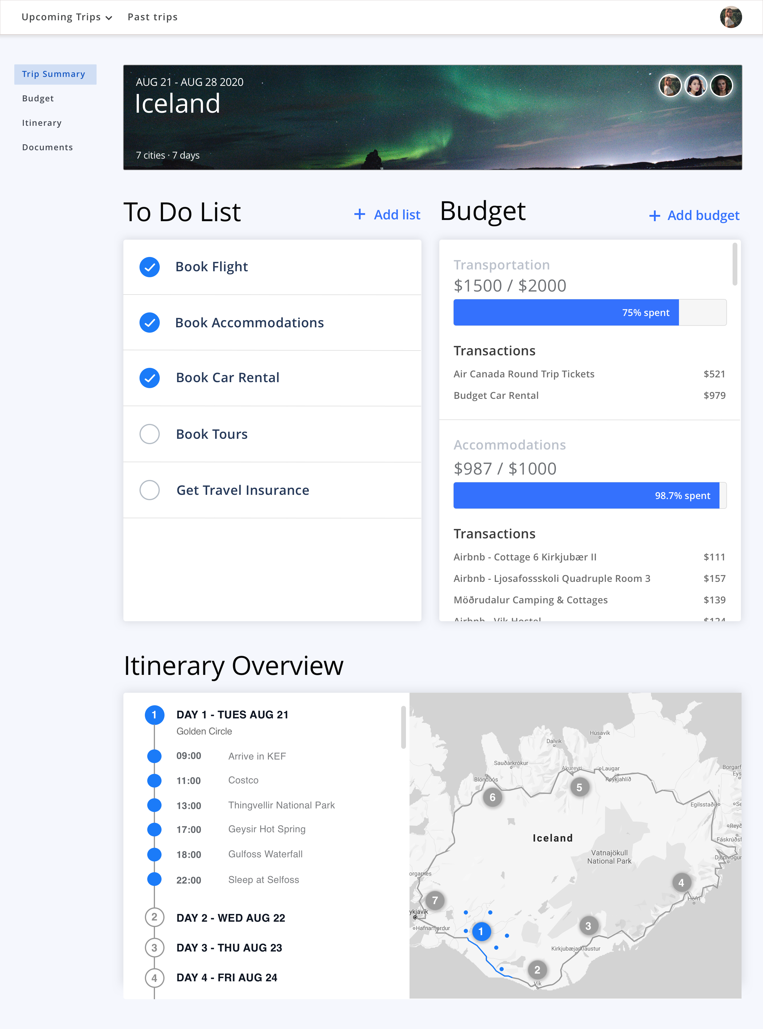
Trip Summary
Trip Summary
This is an overview of their trip. It lists all the things they still need to do before travelling, the budget they set up, and their itinerary overview.
This is an overview of their trip. It lists all the things they still need to do before travelling, the budget they set up, and their itinerary overview.
Itinerary
Itinerary
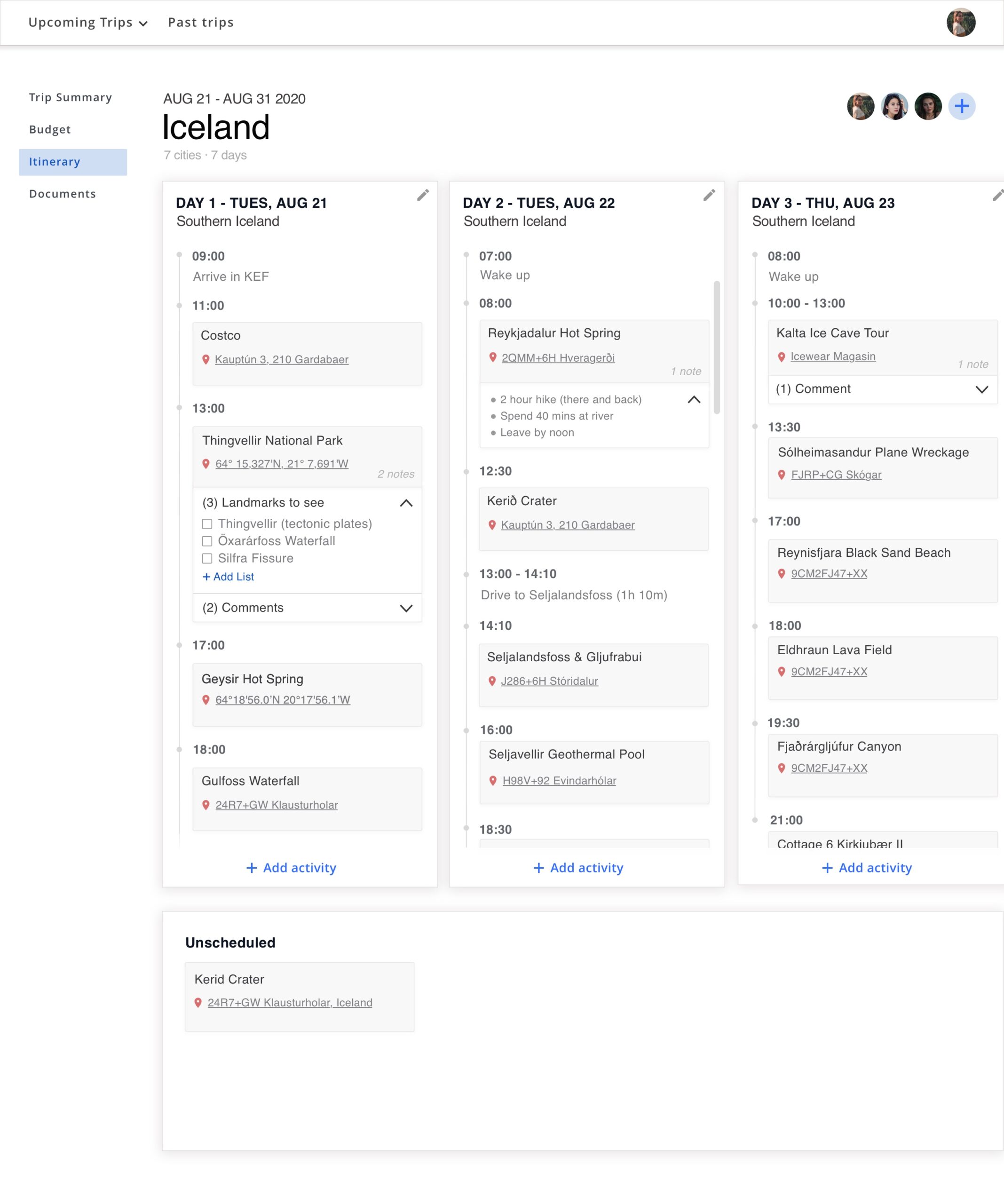
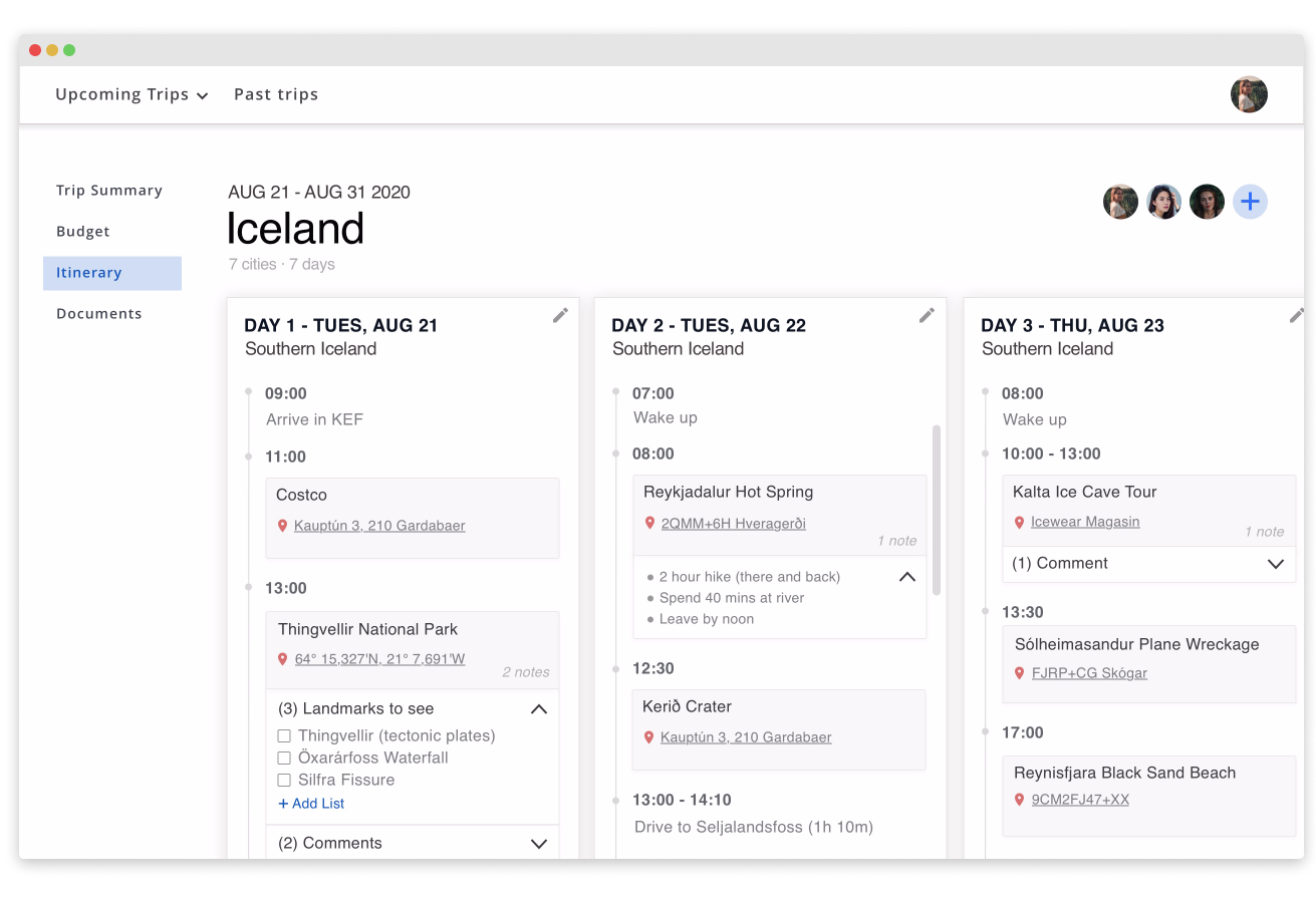
Users can easily map out their trip and add notes or comments to them. They also have the ability to add friends to their plans.
Users can easily map out their trip and add notes or comments to them. They also have the ability to add friends to their plans.
Mobile design
Mobile design
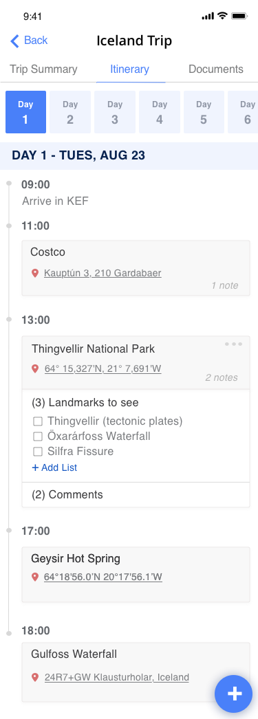
I created a mobile version of the itinerary that allows travellers to easily access their plans on the go.
I created a mobile version of the itinerary that allows travellers to easily access their plans on the go.
Reflection
Reflection
This quick design challenge allowed me to improve my visual design skills. I learned how to be resourceful and find issues people through online forums. Finally, I learned how to prioritize the features I designed because of time constraints.
If I were to do this challenge again, I would have created a survey to get better data and conduct usability testing to understand where I can further improve the product.
This quick design challenge allowed me to improve my visual design skills. I learned how to be resourceful in finding issues people have when trip planning through online forums. Finally, I learned how to prioritize the features I designed because of time constraints.

