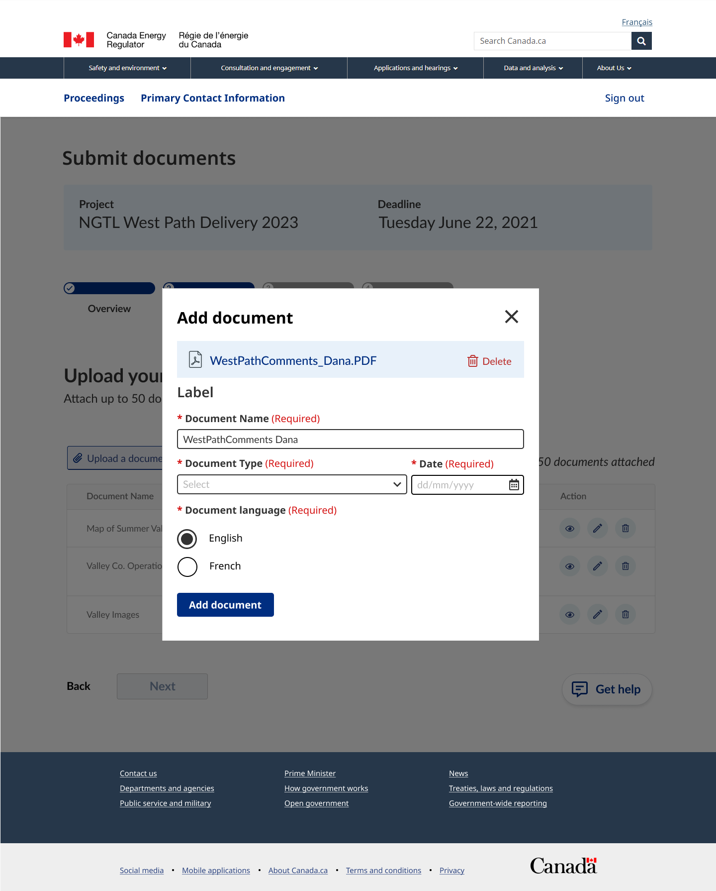
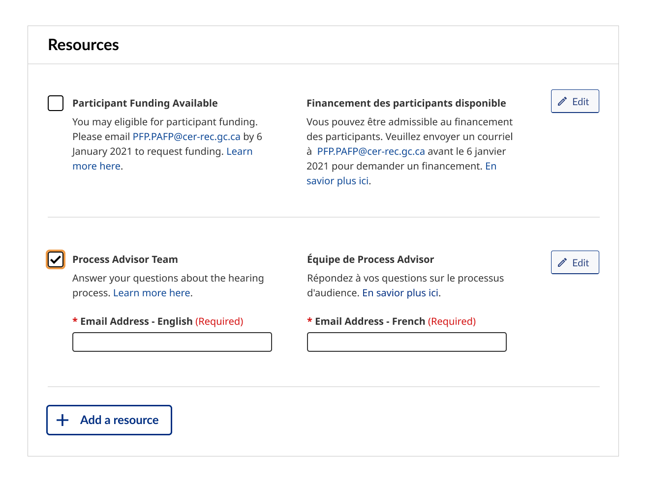
UX Design | Civic Tech | Responsive Web Tools
UX Design | Civic Tech | Responsive Web Tools
Code for Canada
Code for Canada
Reducing barriers to public participation for federally regulated energy projects.
Reducing barriers to public participation for federally regulated energy projects.
Role
UX Research
Wireframe
Prototyping
Usability Testing
Team
Team
1 Designer
1 Project Manager
1 Developer
1 Designer
1 Project Manager
1 Developer
4 Government Staff
Duration
10 months
Nov 2020 - Aug 2021
Nov 2020 - Aug 2021
Overview
Overview
The Code for Canada fellowship is a 10-month program that embeds private industry professionals into government organizations to improve public services.
Fellows engage with residents and work on projects that impact thousands of people across Canada. Along the way, we share best industry practices with government stakeholders, facilitate change management and show what is possible.
For my fellowship, I was placed under the Canada Energy Regulator (CER). The main focus of our work is to improve the digital participation tools related to energy adjudication.
Timeline and process
Timeline and process
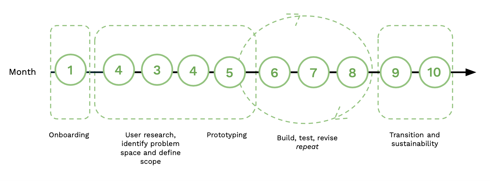
Our team officially kicked off the project in month two, starting with primary and secondary research. Some of the steps fluctuated depending on the needs of the project, but we have to make sure the product outcome is sustainable and transitions successfully to the next team.
Our team officially kicked off the project in month two, starting with primary and secondary research. Some of the steps fluctuated depending on the needs of the project, but we have to make sure the product outcome is sustainable and transitions successfully to the next team.
Our team officially kicked off the project in month two, starting with primary and secondary research. Some of the steps fluctuated depending on the needs of the project, but we have to make sure the product outcome is sustainable and transitions successfully to the next team.
Roles and responsibilities
Roles and responsibilities
Within my team, I was the sole designer working with one product manager, one developer and four government partners.
Within my team, I was the sole designer working with one product manager, one developer and four government partners.
Within my team, I was the sole designer working with one product manager, one developer and four government partners.
✨ User Research
- Planned, recruited and conducted user interviews
- Ran a heuristic evaluation session with my team
- Synthesized research through infinity mapping
- Created user flows
✨ Design and development
- Designed, prototyped and tested product updates with the users
- Worked closely with a developer to ensure product specs
- Created user stories and supported the development of the product requirements document
✨ Change management
- Established weekly design critiques with other designers at the CER.
- Improved cross-government collaboration and encouraged working in the open (e.g., sharing stakeholder engagement templates with Transport Canada and presenting work to individuals at Canada Revenue Agency).
- Encouraged non-designers to become advocates for the user.
✨ Other
- Facilitated 3 workshops across the different lifecycle of the project
- Created 8+ blogs about the fellowship journey
- Facilitated a ClubHouse conversation on designing in government
- Became a panellist at the Open Data Hackathon
Organization goal
Organization goal
The Canada Energy Regulator’s (CER) mandate is to create inclusive participation for members of the public and Indigenous Peoples under the CER Act.
The second goal is to build digital capacity within the CER so it better aligns with the Government of Canada’s Digital Standards. My team has done this by leading workshops, hosting lunch-and-learns, and providing suggestions on process improvements.
Problem
Problem
In the project brief, I learned about the potential barriers to inclusive participation.
They include:
- Technology limitations
- Government web standard to access certain forms
- Lack of clarity about how to access proceedings
- Large time commitment
- Overwhelming amount of information and steps
Challenge
Challenge
How might we reduce barriers to participating in the Canada Energy Regulator adjudication process and promote inclusive participation?
EMPATHIZE
Research
Research
Our team wanted to validate existing assumptions about the problem space and understand the root causes that create barriers to participation.
Our team wanted to validate existing assumptions about the problem space and understand the root causes that create barriers to participation.
Proto-persona workshop
Proto-persona workshop
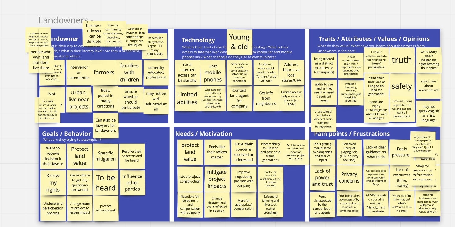
At the start of the fellowship, I facilitated a proto-persona workshop with various internal staff to help identify the people we need to reach out to and tailor the interview questions.
→ Read about the lessons I learned on facilitating my workshop
User interviews
User interviews
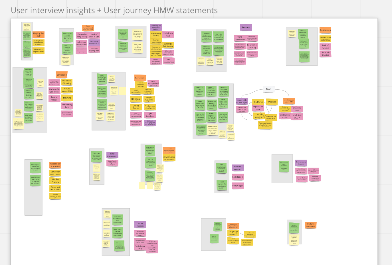
I conducted 9 semi-structured interviews with 11 people regarding their participation experience in the energy adjudication process. We talked to landowners who were directly impacted by pipelines, concerned citizens, a regulatory specialist and people of Metis and First Nations background.
I also interviewed 7 various decision-makers from across our government organization and 7 staff members that run the participation process.
Various factors contribute to barriers to participation. Often times, it is systemic.
Within my team, I was the sole designer working with one product manager, one developer and four government partners.
Various factors contribute to barriers to participation. Often times, it is systemic.
Communication issues
Communication breakdown starts from the first touchpoints, which creates mistrust between participants, the industry and the CER.
Participants have little time
People do not want to be spending time going through the hearing process, but they feel like they have to because of the love and care for the land.
Tools have high friction
The complexity of existing tools and processes unintentionally creates barriers to participation.
People feel intimidated
People felt intimidated by the energy adjudication process and the legal jargon within the participation tools.
User feedback
User feedback
Our team listened to the fears, concerns and frustrations around the energy adjudication process.
Within my team, I was the sole designer working with one product manager, one developer and four government partners.

There’s a lot of legal jargon throughout the process. The average person will not know what a lot of these terms mean and even know how to register to participate.

Writing an email with my comments would have been easier than going through the on of CER’s digital participation process.
Participant journey
Participant journey
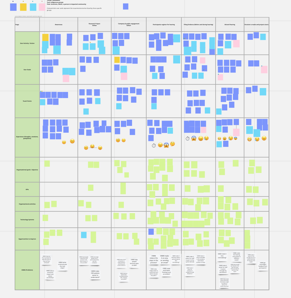
To better understand the barriers to participation during the lifecycle of the adjudication process, my team and I mapped out the participation journey. This allowed us to identify opportunities for improvement while looking at the organizational goals at each stage.
To better understand the barriers to participation during the lifecycle of the adjudication process, my team and I mapped out the participation journey. This allowed us to identify opportunities for improvement while looking at the organizational goals at each stage.
Ease of use and friendliness
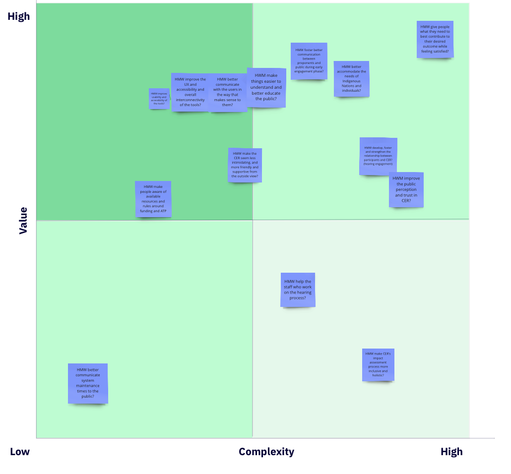
HMW make the digital participation tools more accessible, less overwhelming and easier to go through?
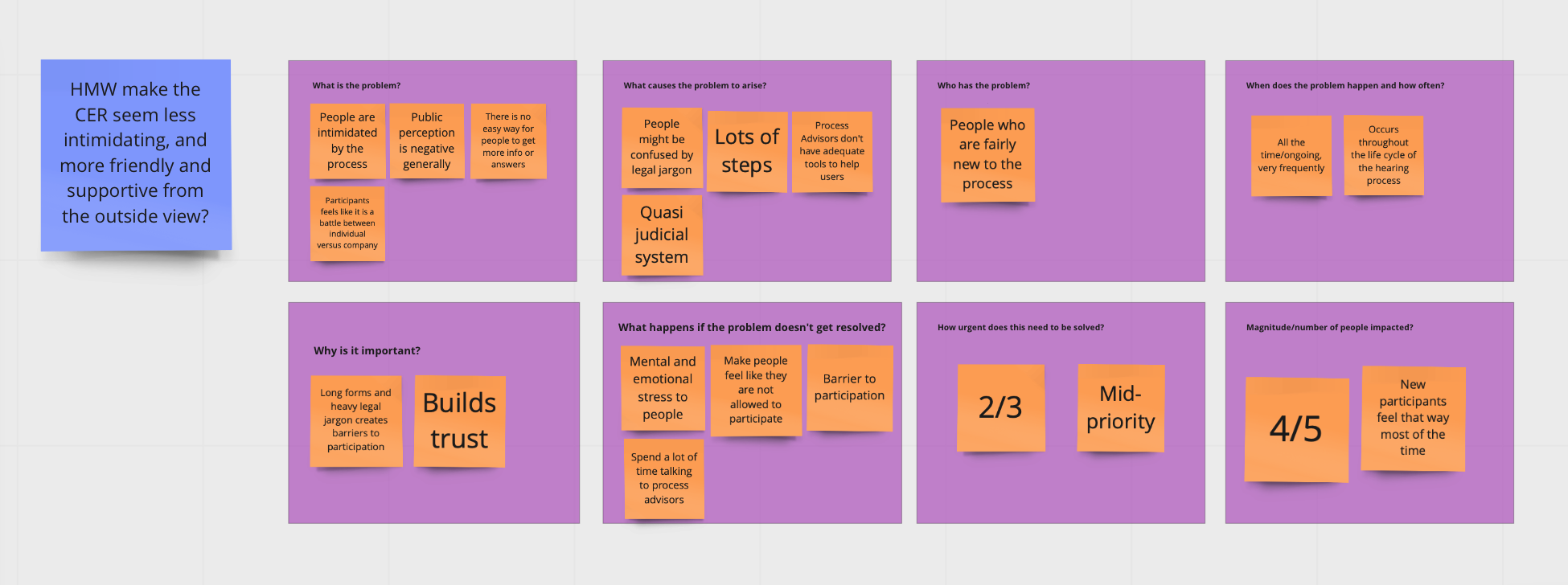
HMW make the CER seem less intimidating and more friendly to first-time participants?
Communication and education
HMW better communicate with the users in a way that makes sense to them?
HWM make things easier to understand and better educate the public on the participation process?
Time
HMW help users save time and reduce redundant work?
IDEATE
4-day design workshop
4-day design workshop
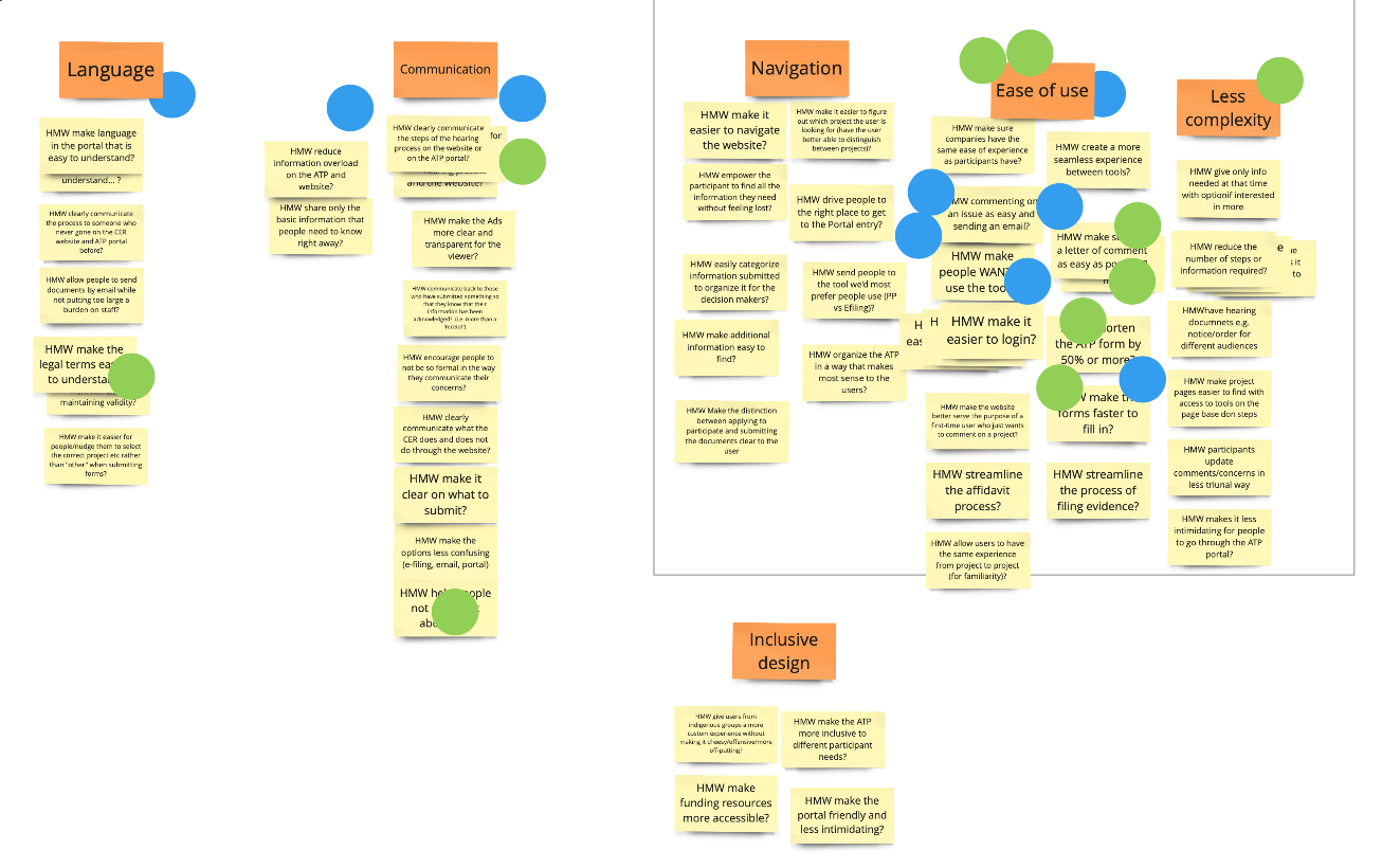
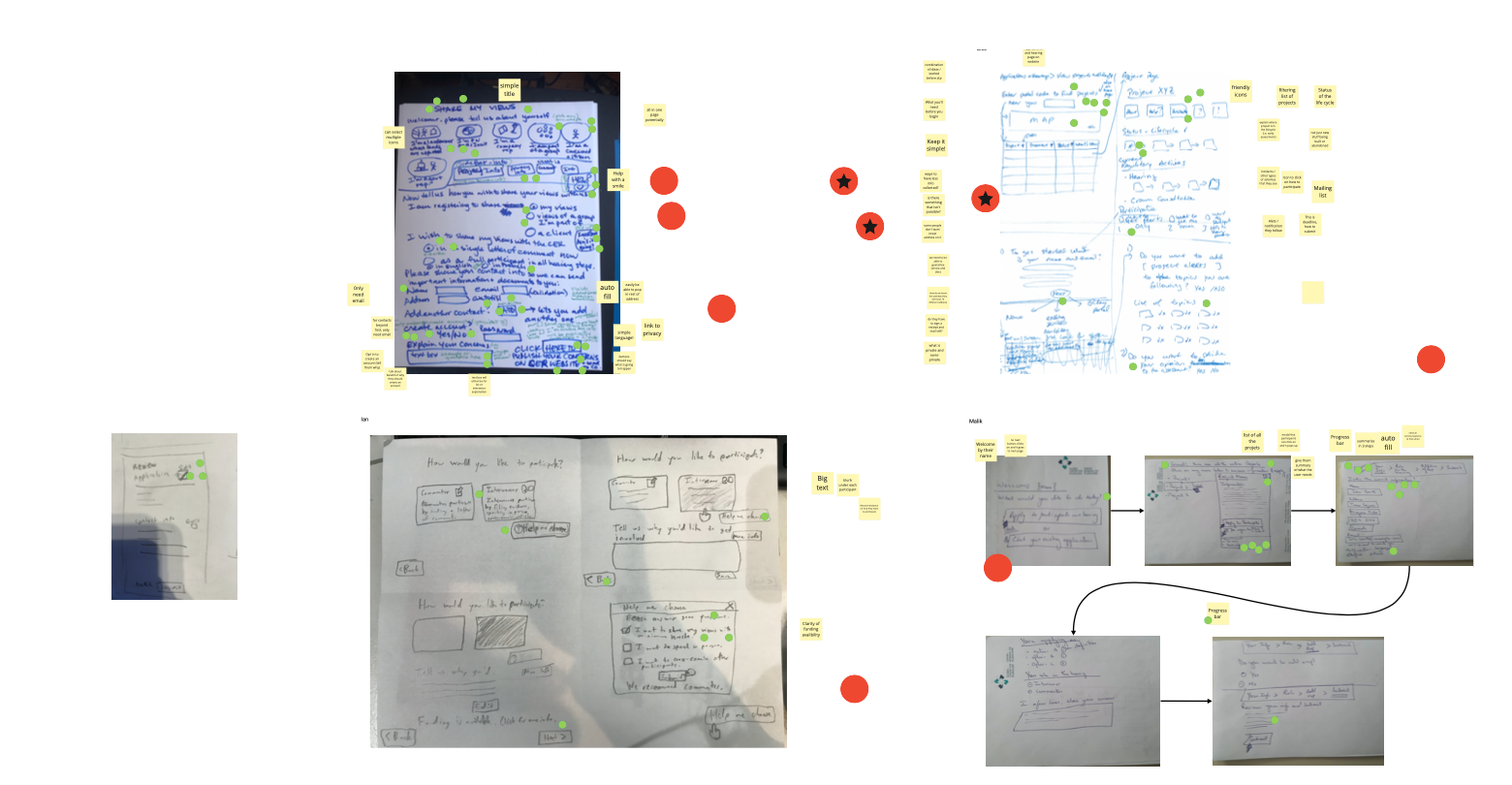
I ran four one-hour workshops spread across the week with government team members to further define the problems we wanted to solve. We focused on the registration process and ideated potential solutions to the key challenges.
Another part of the goal was also to help build digital capacity within the government and teach new ways of thinking. I introduced dot voting, crazy-8s and the scamper method to promote creative problem-solving.
User flow
User flow
Initially, our team went with participant flow version 1 for the first iteration of the prototype. I put account creation near the end because I wanted to reduce the initial friction of participating. However, after testing it with the users and conversing with our government partners, it didn’t make sense to log in later in the process.
Initially, our team went with participant flow version 1 for the first iteration of the prototype. I put account creation near the end because I wanted to reduce the initial friction of participating. However, after testing it with the users and conversing with our government partners, it didn’t make sense to log in later in the process.
Early design iterations
Early design iterations
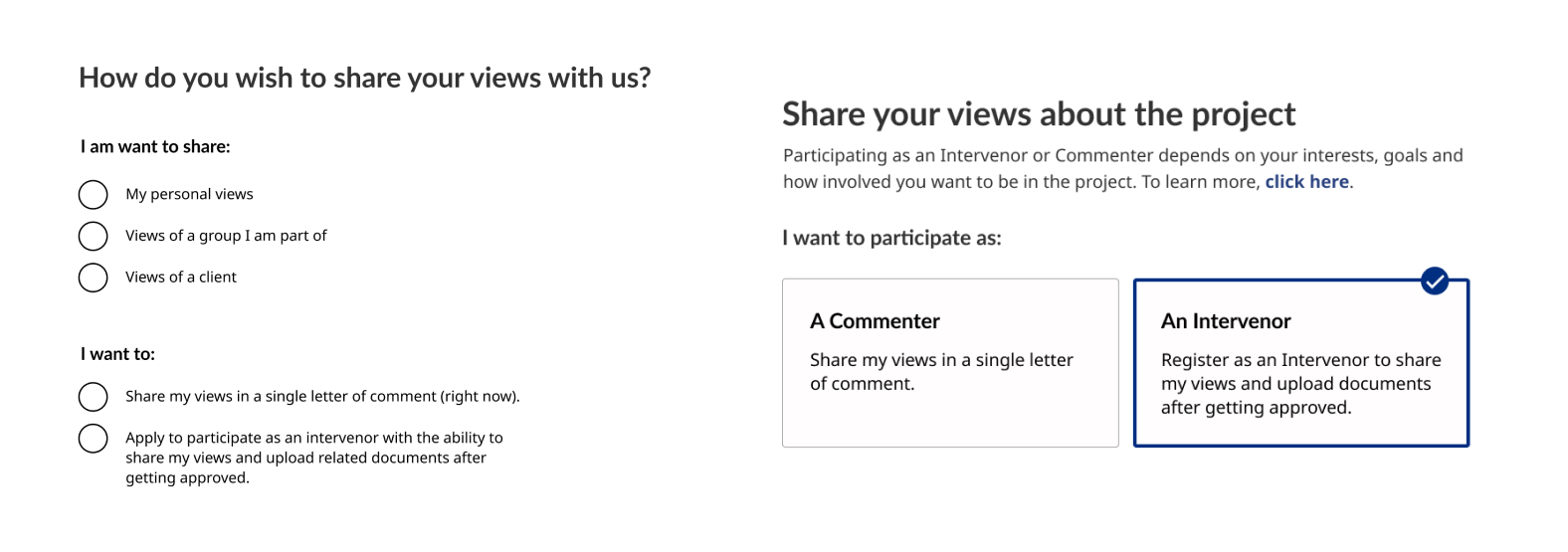
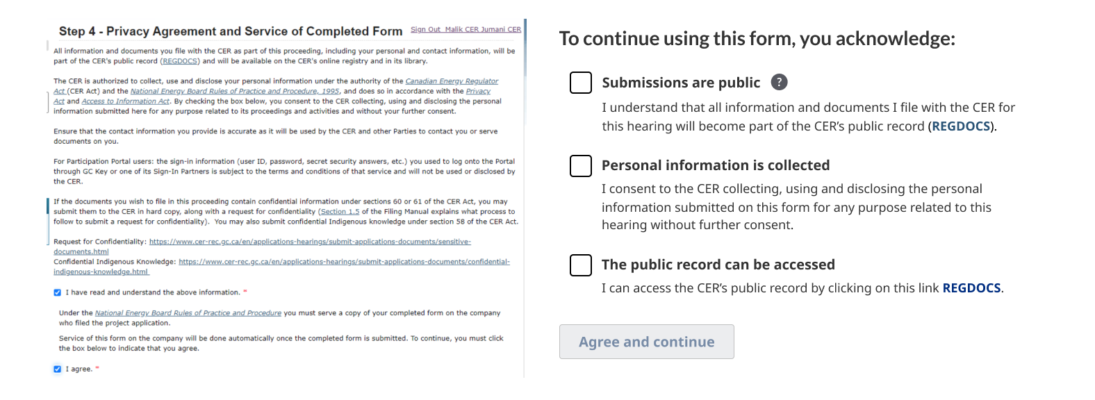
In the first iteration, I did not decouple the two participation methods from the overall system because it impacted the CER’s process. I had to wait on approvals from upper management before making these major changes.
In the first iteration, I did not decouple the two participation methods from the overall system because it impacted the CER’s process. I had to wait on approvals from upper management before making these major changes.
Experimenting with layouts
Experimenting with layouts
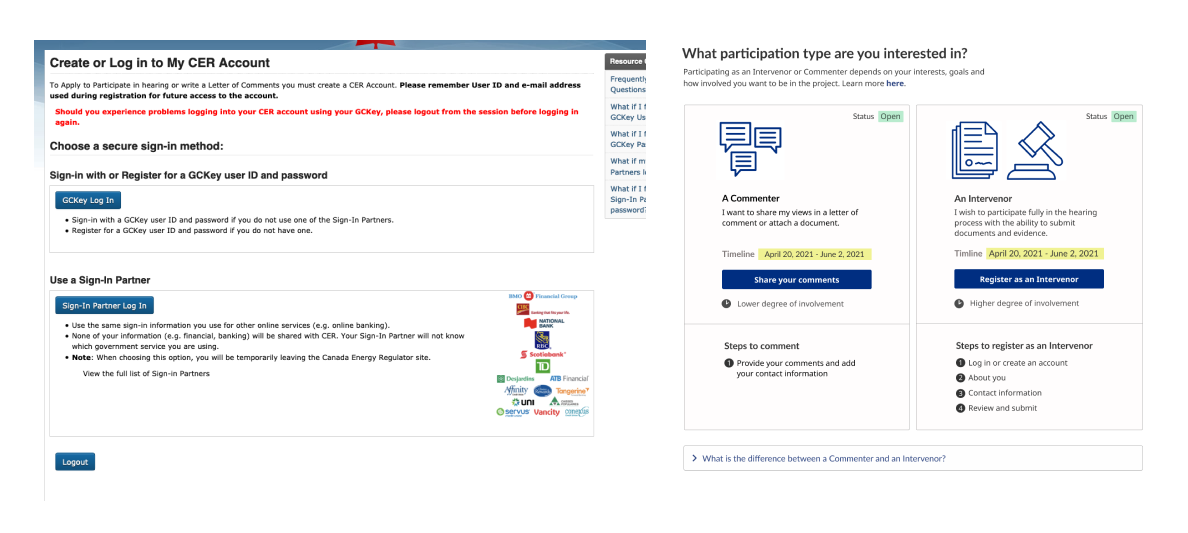
I experimented with a few different ways to meet users where they are and answer any questions they may have at that moment.
Design 1: Is not great because the content is contained in a small box, which makes it hard to compare the information.
Design 2: Worked better than design 1 because people can compare participation types side by side, but it was difficult to scan the information.
Design 3: Uses icons which allows people to quickly understand the differences.
Reducing the amount of steps to register
Reducing the amount of steps to register
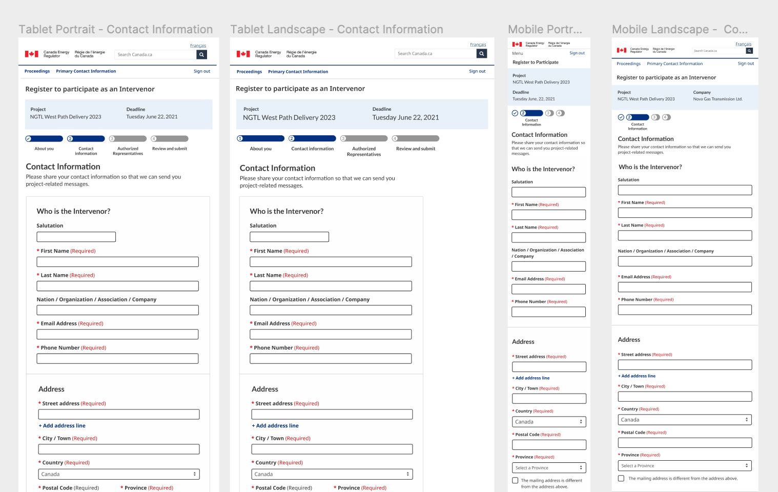
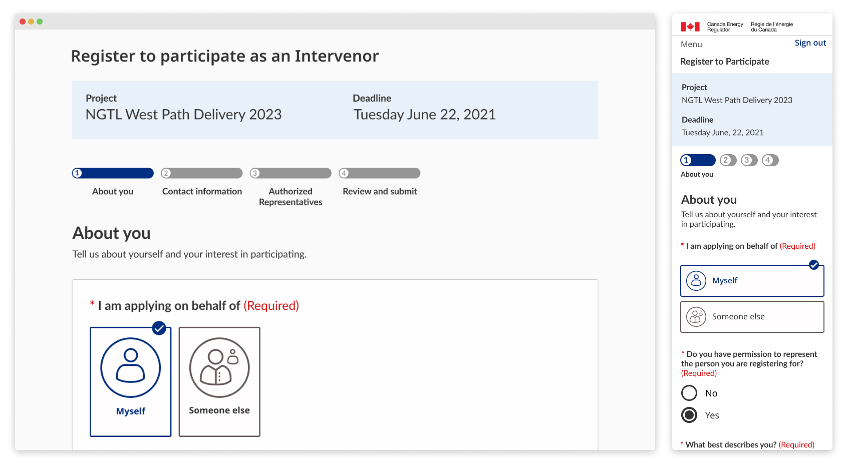
In the usability testing sessions, 5/6 people said it took a long time to go through the registration form. I streamlined the steps and cut down on any redundancies.
In the usability testing sessions, 5/6 people said it took a long time to go through the registration form. I streamlined the steps and cut down on any redundancies.
Constraints
Constraints
Some of the major challenges include balancing the complexity of the quasi-judicial system and accounting for the varying needs of hearing participants.
Within my team, I was the sole designer working with one product manager, one developer and four government partners.
Some of the major challenges include balancing the complexity of the quasi-judicial system and accounting for the varying needs of hearing participants.
⛔ Legal rules and regulations
The changes we made to the design impacted existing processes and rules. We had to evaluate which ones were flexible and which ones cannot be bent.
⛔ Red tape
Working within government often means running into bureaucracy. Sometimes there is a long wait time to get things approved, so our team had to take calculated risks to move the project forward.
⛔ Access to technology varies
The people that tend to be the most impacted by energy projects were those living in rural communities. They did not have great access to the internet and was not confident with using technology.
⛔ Limited time
Our time in government is short, so we had to prioritize the problems and features that would have the highest impact, but easiest to tackle.
⛔ No existing design systems
There are no design system libraries within the CER or on Canada.ca that was made for designers. I asked around to piecemeal existing components from different government organizations or created my own.
Results
Roles and responsibilities
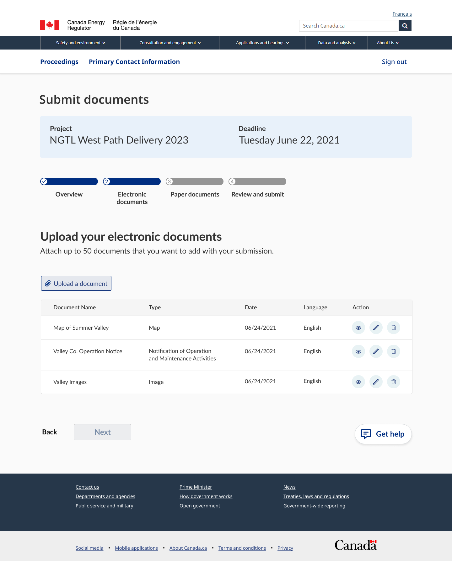
When we tested the first iteration of the prototype, many participants gave it a high rating when compared to before.
Within my team, I was the sole designer working with one product manager, one developer and four government partners.
Within my team, I was the sole designer working with one product manager, one developer and four government partners.
8.2/10
Participant rating of the updated designs
User feedback
Roles and responsibilities
We also got some positive feedback that aligned with the goals or removing barriers to participation.
Within my team, I was the sole designer working with one product manager, one developer and four government partners.
Within my team, I was the sole designer working with one product manager, one developer and four government partners.

This form makes it easy enough for a lot of Indigenous Nations to use. That’s important for those who want to fill it out independently, without the support of consultants.

The experience was great! It simplifies the process and is a lot shorter to navigate than the previous tool.
Reflection
Working as a UX Design Fellow at Code for Canada has been a wonderful and unique experience. Coming in, I was not fully confident in my research skills, and my ability to be the main decision-maker on the designs I was working on. However, with a lot of support from my team, mentor, government partners, the CER’s design team, and the Code for Canada staff and alumni, I was able to rapidly expand my skills.
This fellowship has revealed another aspect of being a designer. I learned how to become a better facilitator, build relationships across the organization, understand best practices for stakeholder engagement and how to manage expectations.
Another aspect of this fellowship that I loved was the ability to take an opportunity and run with it. For example, I set out a goal to publish 20 blogs by the end of the fellowship, start an internal podcast, present at lunch-and-learns, experiment with workshops and get involved in building the Canada.ca design system components in Figma.
Key learnings
Key learnings
The fellowship helped accelerate my growth as a designer. Here are some key things I learned along the way.
Within my team, I was the sole designer working with one product manager, one developer and four government partners.
1. Always document
At the start of the fellowship, I did not spend enough time documenting the decisions that my team and I made. This was important because we would not always remember why we made certain changes.
2. Plan your meetings
Planning and sharing documentation beforehand will help everyone get aligned and clear on the goals of the meeting.
3. Know your audience
When it comes to sharing work with our VP-level stakeholders, I learned how to present information in a way that aligned with their objectives.
4. Pick your battles
When I was constrained on time, I had to be selective on the things I worked on. This meant that sometimes I was not able to do user research around new features I wanted to implement.
5. Always consider accessibility
Inclusive and accessible design needs to be built into the design cycle. I tried to consider all the different factors that impact someone’s ability to participate. My team also assigned roles to make sure everything is aligned to the WCAG standard.
6. Over-communicate
When things are not 100% clear or defined, it is important to be honest and bring it up to the team. This was especially important since everyone was working remotely.
