UX Design | Enterprise | Responsive Web
Redesigning Cetaris.com
Redesigning Cetaris.com to improve customer conversions.
Redesigning Cetaris.com to improve customer conversions.
Role
UX Research
Ideation
Wireframe
Prototyping
Usability Testing
Illustrations
Team
Team
1 UX Designer
1 Project Manager
1 Developer
Tools
Sketch
Illustrator
Zeplin
Trello
Project Type
Responsive Website
UX Design
Duration
Duration
9 months
Nov 2018 - July 2019
Nov 2020 - Aug 2021
Overview
Overview
During my time at Cetaris, I had the opportunity to redesign the marketing website and improve the information architecture of the customer support application. I helped improve website usability to increase conversions and enhance the quality of traffic (reduce bounce rates, increase time on page, and increase conversion rates).
Some of my work is under NDA. For more details, please contact me.
Team Setup and Role
Team Setup and Role
I was situated under the marketing and design team, with one copywriter/project manager, one illustrator, and a third-party developer. Every week I worked with the lead UX designer on the product team to get feedback and critiques on my work.
My main role in this project included creating user interview questions, coming up with user flows, designing low and high-fidelity wireframes, collaborating with the developer to bring the designs to life, and QA testing for bugs. Some minor work I did involve creating hero illustrations for the industry page and creating product mockups.
Problem
Problem
Through customer interviews, Fullstory sessions, and Google Analytics, I uncovered five issues that occurred within the marketing website:
- High bounce rate
- Low session duration
- Inconsistent design style
- Lack of content clarity
- Information architecture within the navigation
Challenge
Challenge
How might we reduce bounce rates while increasing conversions and customer acquisitions on Cetaris.com?
Solution
Solution
The redesign of Cetaris.com focused on three main aspects:
- Improve the information architecture and website accessibility.
- Align the website design styles with the customer-facing products that was in place.
- Revise website content by “showing” Cetaris products rather than “telling” prospective customers about it.
Approach
Approach
In this project, my team and I used the Kanban agile system. We used Trello to monitor the progress of each task within the first release and prioritized the work based on how often users visit each page.
Phase work deliverables
Phase work deliverables
In the first release of the website, our goal was to redesign the home page, product pages, industry pages and contact page. The company page would be left alone until the next iteration. However, based on time constraints, I was not able to fully redesign the industry pages.
User Research
User Research
Our goal was to interview recently converted customers. They were decision-makers during the selection process for fleet maintenance software. In the research session, our main goal was to understand the mindset of prospective customers during the buying process and see what they valued in maintenance software.
I also analyzed FullStory sessions to see the user journey and touchpoints that allowed users to convert, and how to further improve on it.
Card sorting
Goal: Card sorting was used as a way to understand what our customers and prospective customers valued when deciding on a maintenance software solution. It allowed us to prioritize the content.
Website walkthrough
Goal: To understand how prospective customers go through the website. It also allowed us to see the full picture of the customer buying journey.
1-1 interviews
Goal: This method provided qualitative data that informed the design direction.
Design
Design
Based on the research and journey mapping phase, I translated the insights onto the redesign.
Based on the research and journey mapping phase, I translated the insights onto the redesign.
Landing page
Landing page
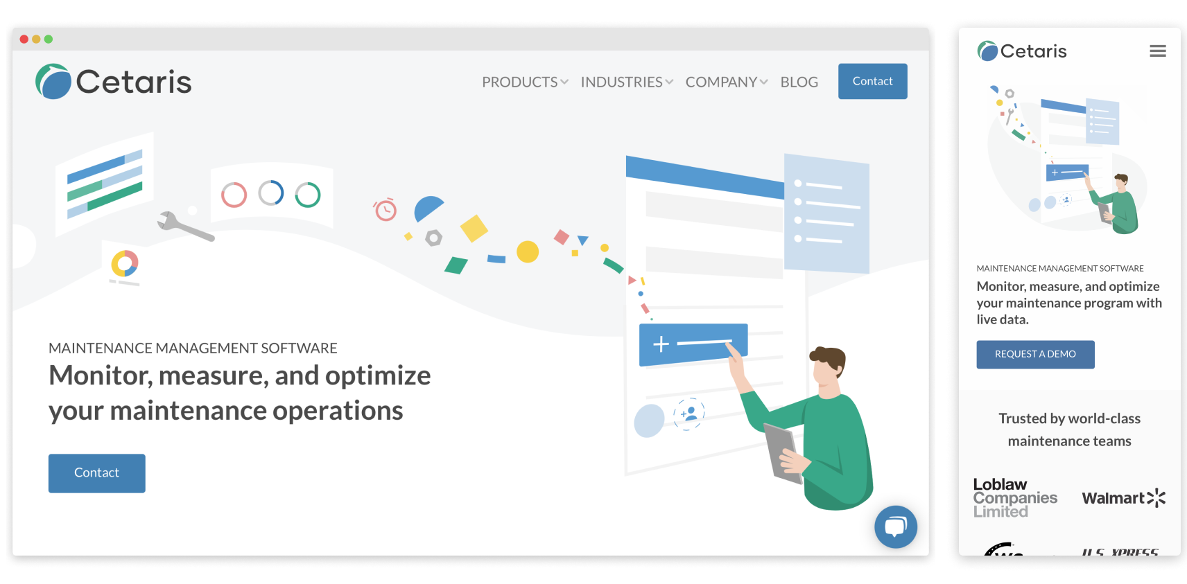
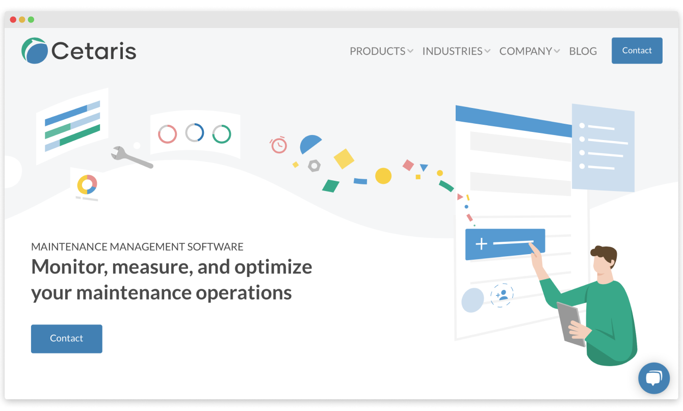
We rethought the messaging and created supporting illustrations to make it more clear what Cetaris did.
Navigation
Navigation
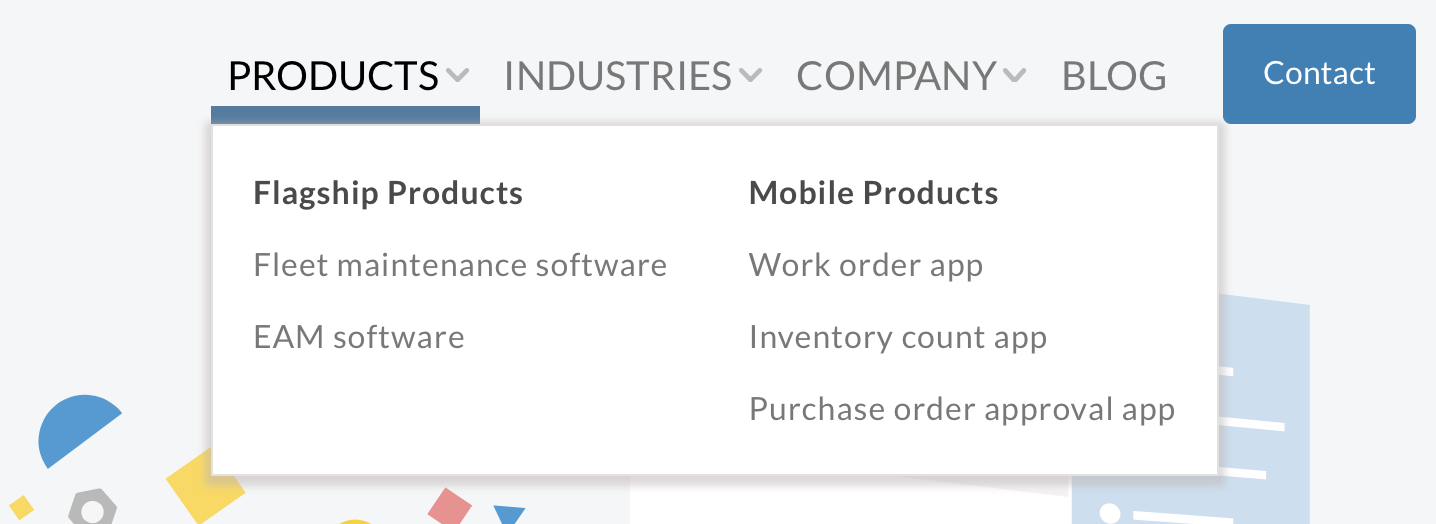
The new dropdown menu was designed to create a clear differentiation between the different products that Cetaris offers.
Products
Products
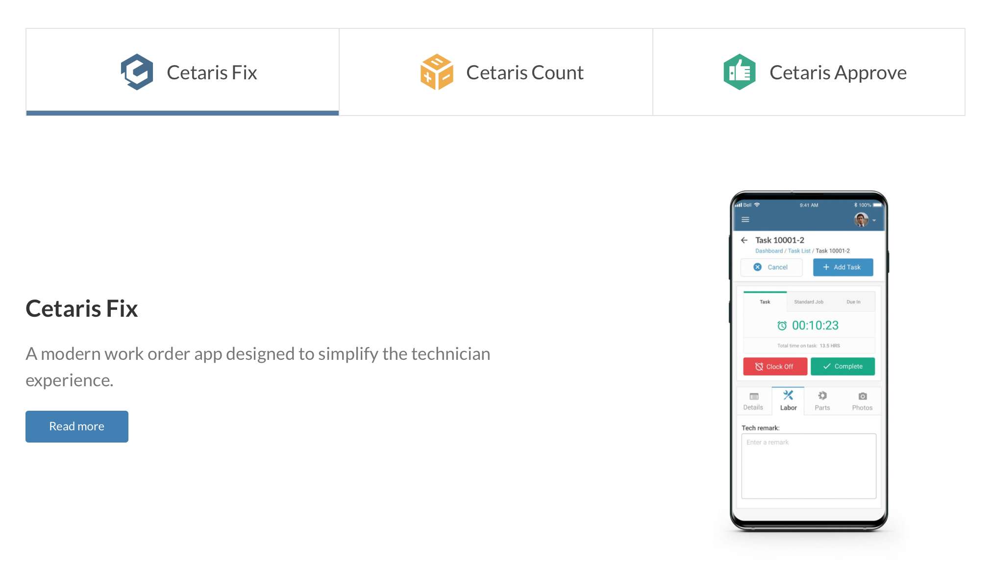
This section allows users to navigate directly to different Cetaris products.
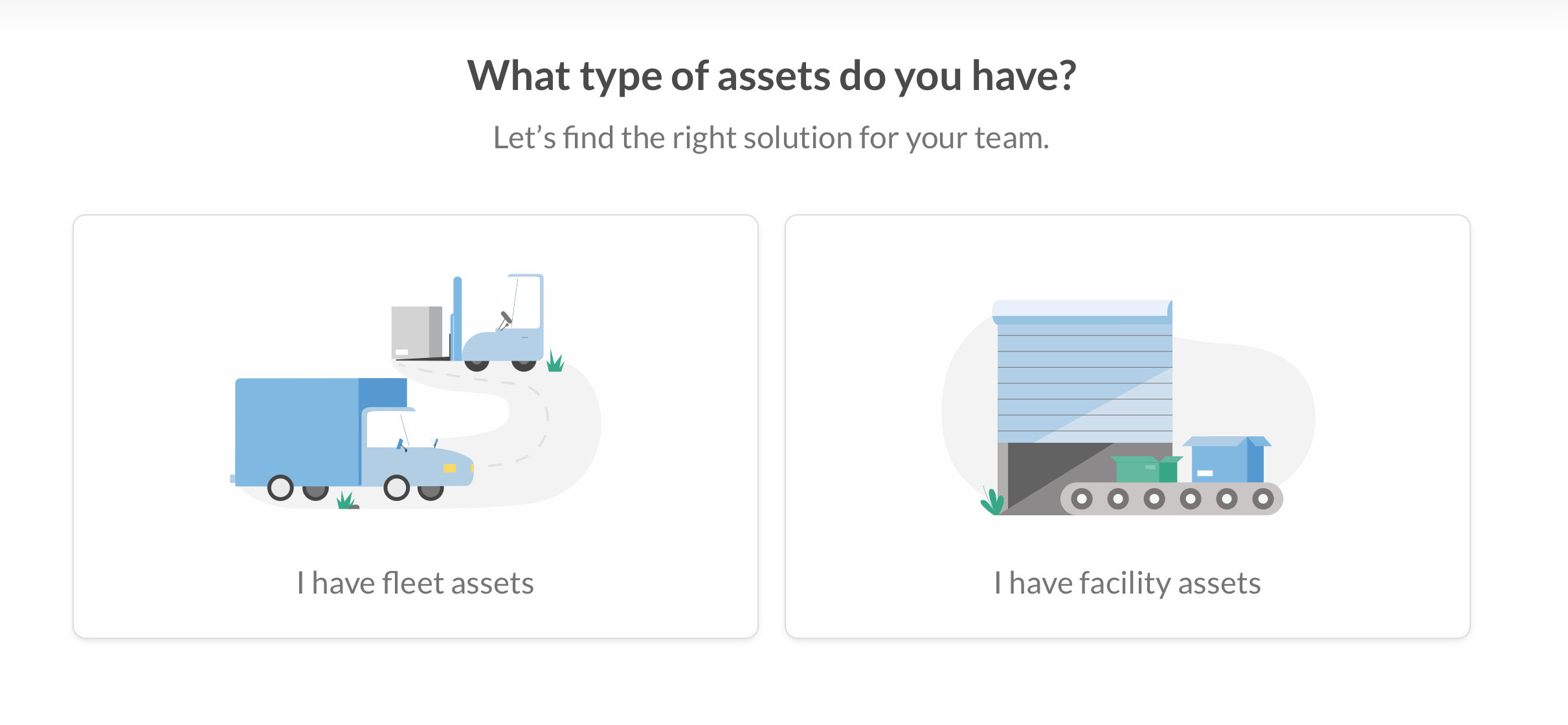
Asset type
Asset type
The two buttons (fleet assets and facility assets) was created to guide users to the right products they seek.
The two buttons (fleet assets and facility assets) was created to guide users to the right products they seek.
See the full website
See the full website
Challenges and learning
Challenges and learning
Over the course of the project, I faced many challenges. During the research phase, it was difficult to find prospective customers to interview that were within our niche (maintenance software) and who held upper management roles. Therefore, the second-best option was to speak to new customers who recently converted through our website.
Another challenge I experienced was balancing the needs of SEO and content with user experience. In the old website, most people ended up skipping over a lot of the content because it was overwhelming to consume. I tried to fix that issue by working with the copywriter to reduce the amount of copy that was shown to users. In the end, we had to compromise between having a specific amount of content for SEO and searchability purposes.
Working with a third-party developer effectively required alignment on shared processes and communication protocols. One tool that was particularly helpful was implementing an excel sheet to document and report bugs during acceptance testing in the development phase.
